graphic design

Tenuta Baiamonte packaging system for Pietra di Mamma, Mamma Tempesta and Mamma Ombra

Tenuta Baiamonte Brand Identity and Wine Packaging

A volcanic identity for three wines from Etna

Tenuta Baiamonte is a boutique winery on the north slope of Mount Etna in Sicily, at 959 metres above sea level. The commission was to create the identity and packaging for an emerging estate and its initial three-wine range: Grecanico, Nerello Mascalese and Grenache.

Read the full story

The challenge was not simply to make another volcanic label. It was to give a small premium producer one recognisable voice, while allowing each wine to express a different character.

From research to a coherent brand system

The work began with the estate brief, competitor review, varietal research and brand positioning. The intended character was authentic, elegant, premium, timeless and distinctive, with a contemporary expression of Etna rather than a literal illustration of the volcano.

duskodesign developed the strategic direction, brand mark, wine names and the complete packaging system.

Etna as mother, not as postcard

The central idea was Mamma Etna, understood as a maternal presence that can nurture and renew, but also cast shadow and release great force. This tension created a more distinctive territory than the familiar postcard image of a volcano.

The three final names became different expressions of the same source: Pietra di Mamma, Mamma Tempesta and Mamma Ombra. Volcanic stone imagery gives each wine a geological portrait, while the names introduce emotion and character.

A mark oriented to the north

The Baiamonte mark combines a reduced profile of Etna, a north marker and a crown-like crest. It connects the estate’s position on the north slope with the sense of distinction required for a boutique winery.

Restrained typography keeps the system contemporary and allows the stone imagery to remain central across labels, capsules and corporate applications.

Tenuta Baiamonte logo printed on textured paper

One family, three characters

All three labels share the same white field, typography, layout and Baiamonte signature. The stone changes with the wine, creating individual characters within one recognisable family.

Pietra di Mamma

For the Grecanico, Pietra di Mamma uses an ochre-covered volcanic stone. Its warm mineral surface gives the white wine a tactile identity while retaining the lightest presence in the range.

Pietra di Mamma Grecanico bottle with ochre volcanic stone label
Pietra di Mamma label detail with ochre volcanic stone

Mamma Tempesta

Created for the Nerello Mascalese, Mamma Tempesta uses an irregular fragment of dark lava. Small details selected in gold bring light and value to the raw geological surface, making this the most forceful expression in the family.

Mamma Tempesta Nerello Mascalese bottle with dark lava label
Mamma Tempesta label detail with gold accents on dark lava

Mamma Ombra

For the Grenache, Mamma Ombra is represented by a smooth black stone crossed by a fine gold incision. Its reduced form creates the quietest and most enigmatic character of the three wines.
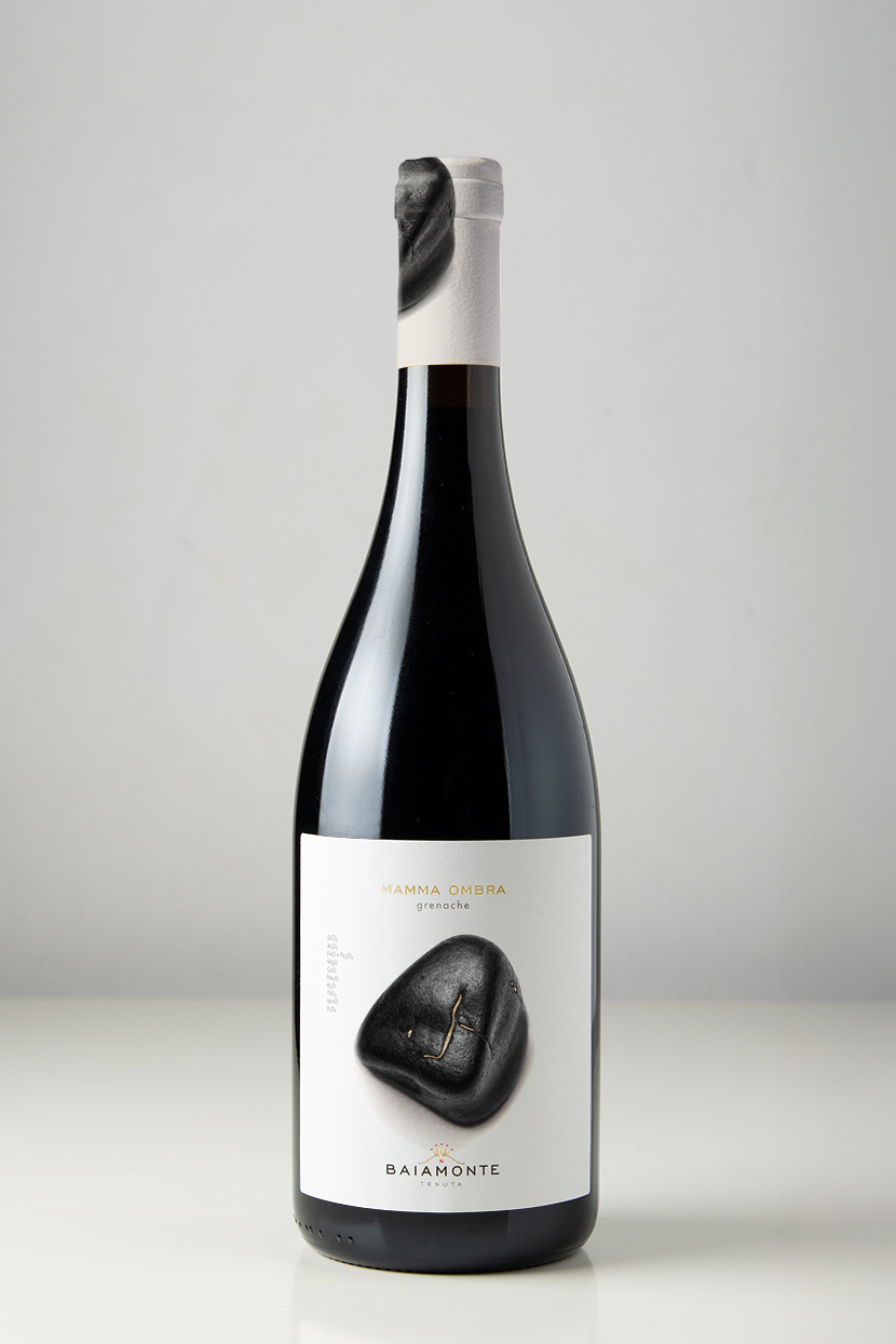
Mamma Ombra Grenache bottle with smooth black volcanic stone label

Material detail without excess

The production system was specified around white label stocks, black and grey inks, a controlled red accent and Kurz 429 gold foil. The capsule designs continue the volcanic imagery beyond the front label, giving the bottles a coherent presence from closure to base.

Tenuta Baiamonte logo, colour palette and production specifications

From concept to print

duskodesign developed the research, positioning, wine naming, brand identity and complete packaging system. The production scope included front and back labels for three wines, capsule design, colour and foil specifications, print-ready artwork and technical preparation for printing.

The result is one coherent identity with three individual characters, all connected to the same estate and the same mountain.

Italray radiological equipment with touchscreen GUI designed by duskodesign

Italray Radiology GUI Design

Turning complex equipment states into a clear touchscreen interface

Italray asked duskodesign to develop the graphical interface for a radiology control console. The challenge was not simply to redesign a screen, but to organise a dense system of patient, examination, radiation and equipment movement information into an interface that could be understood at a glance.

The system also needed to adapt to different devices, configurations and operating conditions without losing consistency.

Designing the system before styling the screen

The work began with a detailed study of the requirements, an onsite examination of the equipment, user research and conversations with Italray’s product and technical team.

Read the full story

We mapped which information needed to remain visible, selectable, inactive or hidden across four principal console states, from examination selection to an open acquisition window. This established a clear hierarchy between primary actions, radiation parameters, mechanical movement controls, warnings and device status.

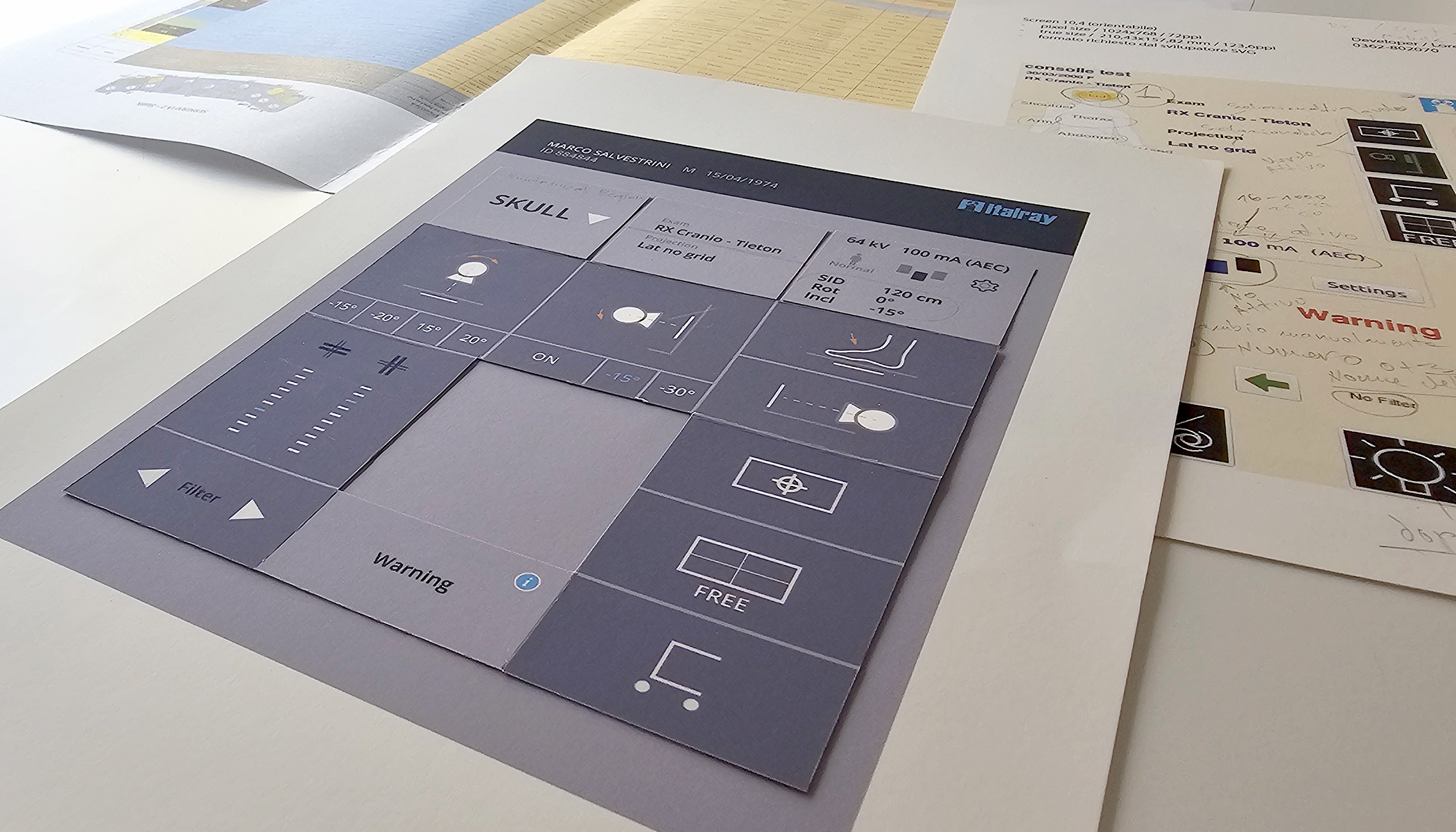
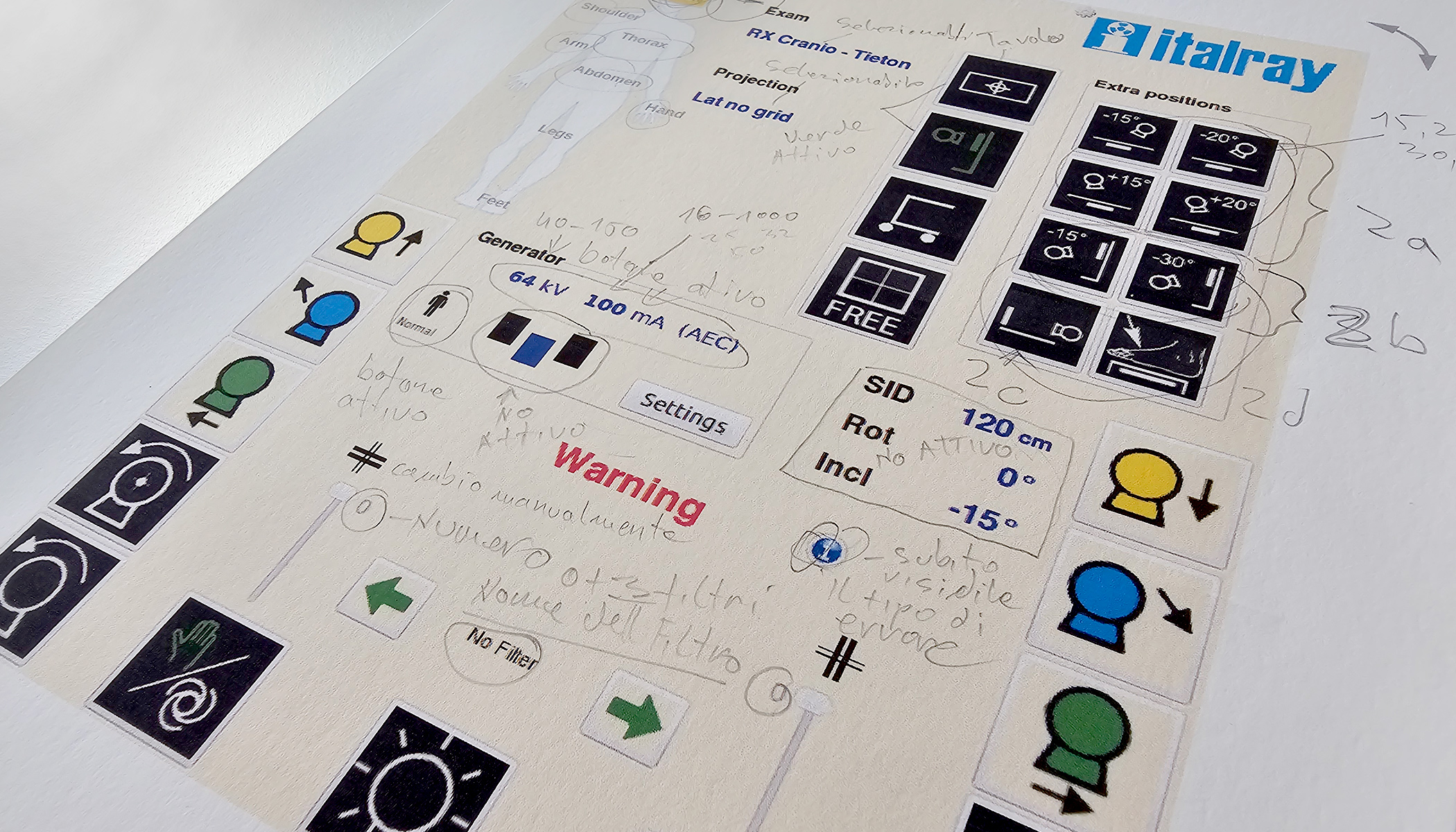
Information architecture and wireframes were then developed into a modular paper prototype. Movable elements made it possible to compare layouts and evaluate the relationships between controls, information and different equipment states before committing to the final visual design.

Early requirements and interface logic for the Italray radiology console
Requirements and early interface logic
Modular paper prototype developed for the Italray touchscreen interface
Modular paper prototype

From paper prototype to implemented equipment

The final interface uses a restrained visual system in which primary information, radiation data and mechanical movements are clearly differentiated. Active controls, selectable information and unavailable functions are organised through three distinct visibility levels.

Read the full story

The system was also designed to support different console formats, horizontal and vertical layouts, multilingual content, standardised radiology icons, warnings, error states and different equipment configurations.

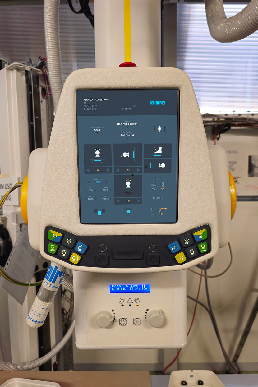
Following iterative review and fine tuning with the Italray team, the final interface assets and implementation specifications were prepared for production. The resulting touchscreen system was implemented on Italray radiological equipment.

Italray radiological equipment with the implemented touchscreen interface designed by duskodesign

Role

duskodesign led the requirements analysis, user research, information architecture, wireframing, paper prototyping, UI design, interface system development, iterative refinement and production handoff in close collaboration with Italray’s product and technical team.

Services

UX Research, Information Architecture, Wireframing, Paper Prototyping, UI Design, Interface System, Production Handoff

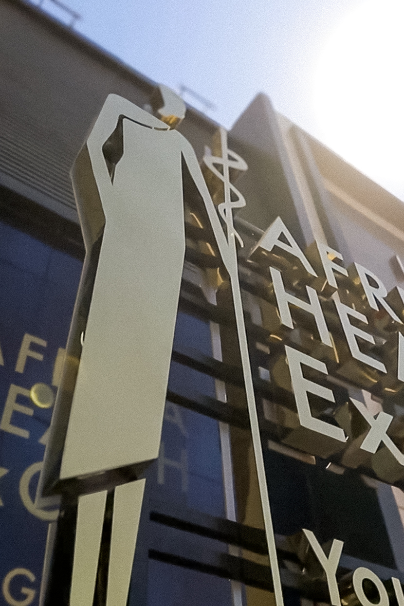
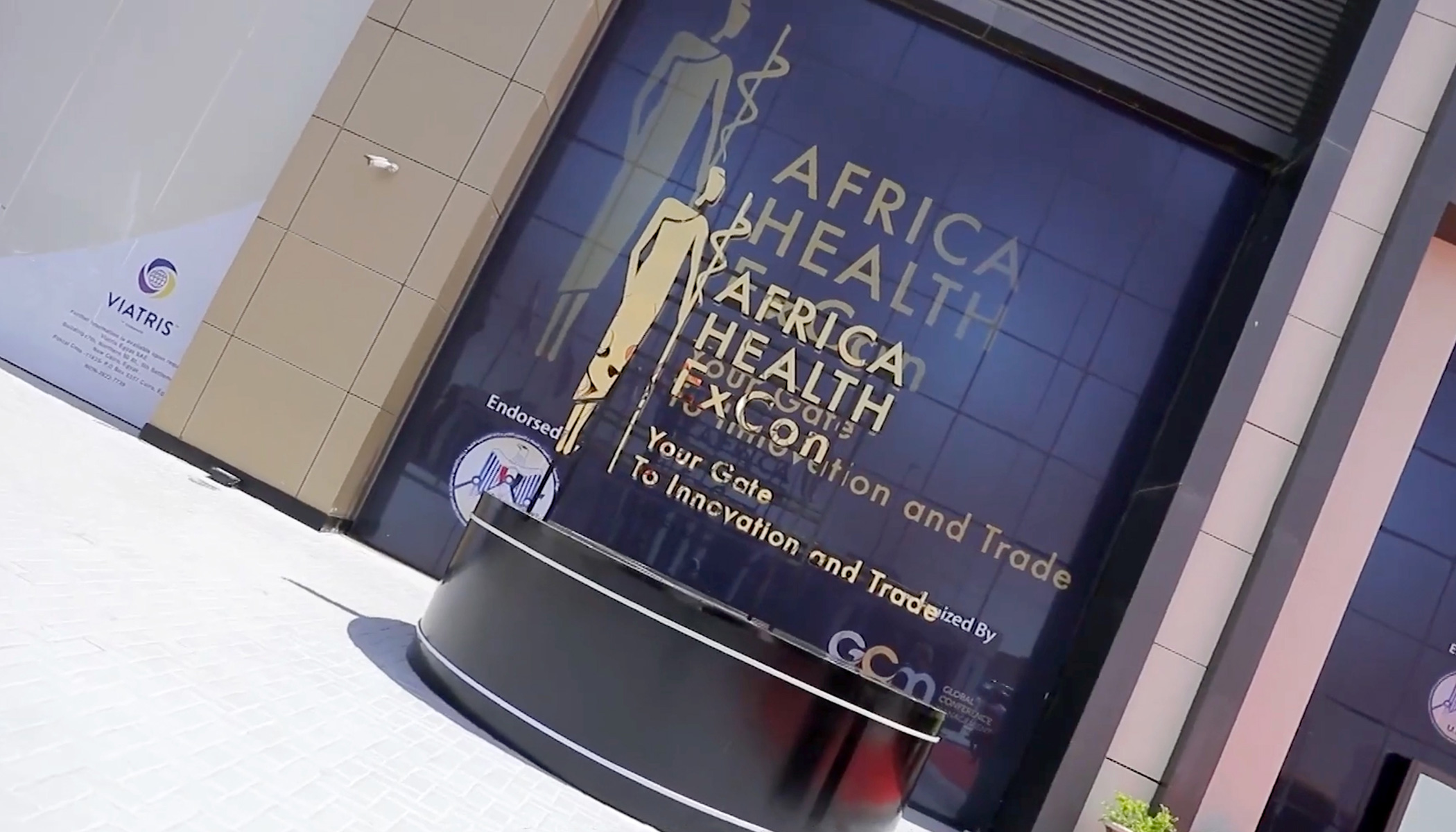
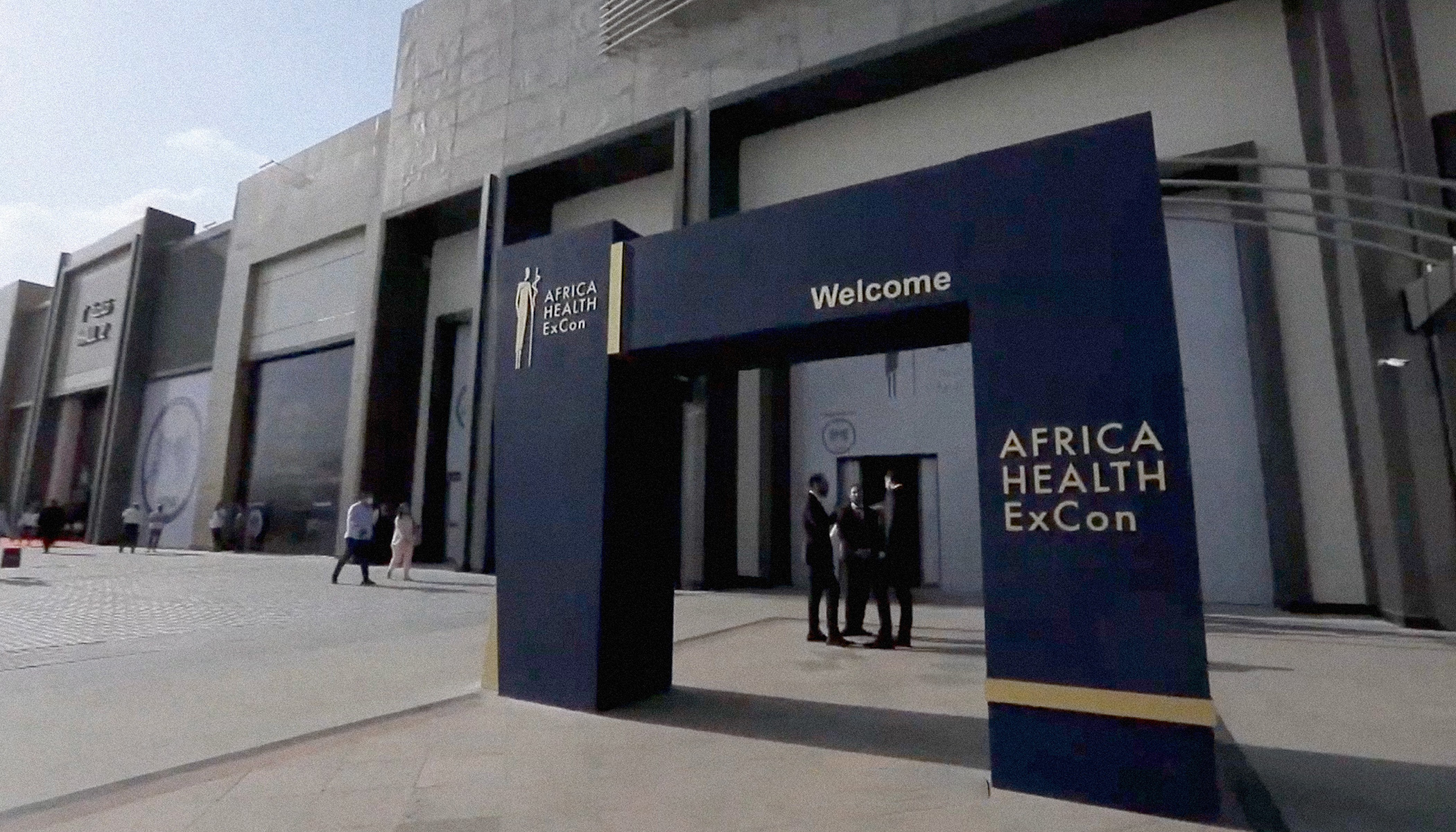
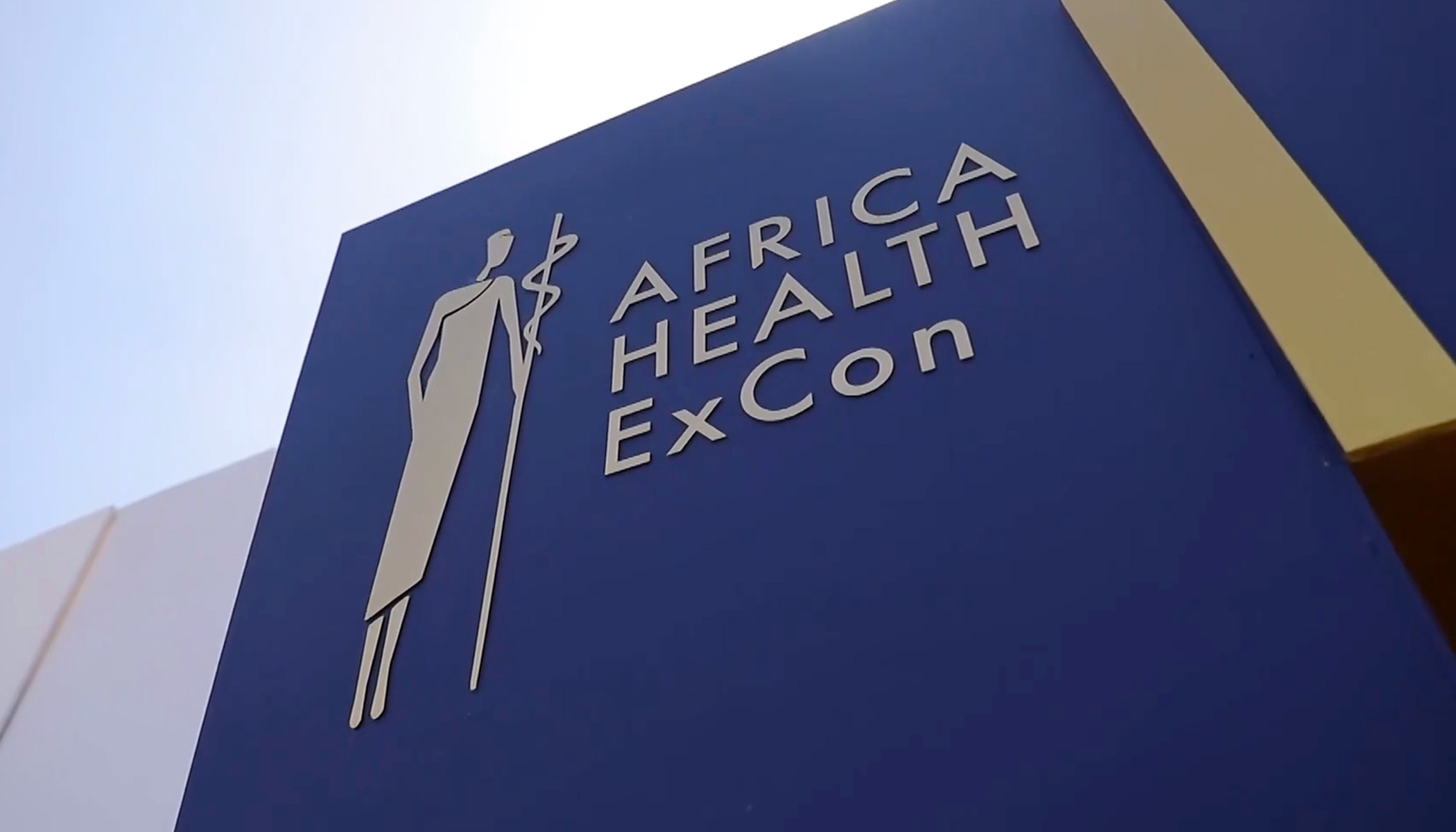
Africa Health ExCon logo applied to the main event entrance in Cairo

Africa Health ExCon Logo Design

A symbol created for a continental healthcare platform

Africa Health ExCon is a major annual healthcare event in Cairo, bringing together policymakers, healthcare leaders, professionals and industry representatives from across Africa and the international market.

Read the full story

The challenge was to create a distinctive and immediately recognisable symbol capable of representing healthcare, cooperation and progress at a continental scale. It also needed to remain clear across very different applications—from digital communication and printed material to large architectural signage and exhibition environments.

Building several ideas into one mark

The design process began by examining how the African continent, healthcare and human connection could be expressed without relying on a collection of separate, predictable symbols.

Read the full story

The final mark brings these ideas into one reduced vertical form. Its open structure and controlled geometry allow multiple associations to coexist while preserving a clear and memorable silhouette.

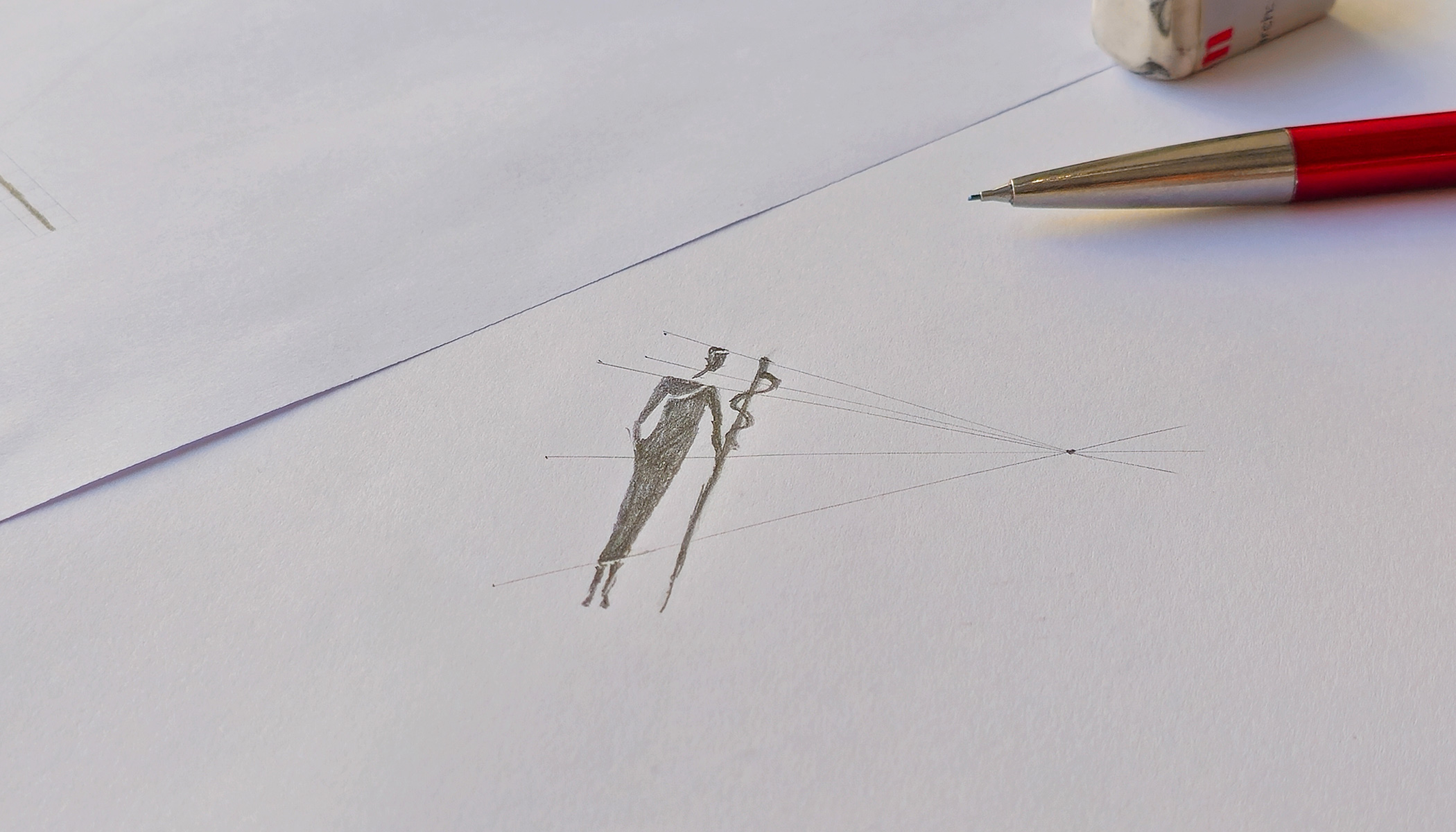
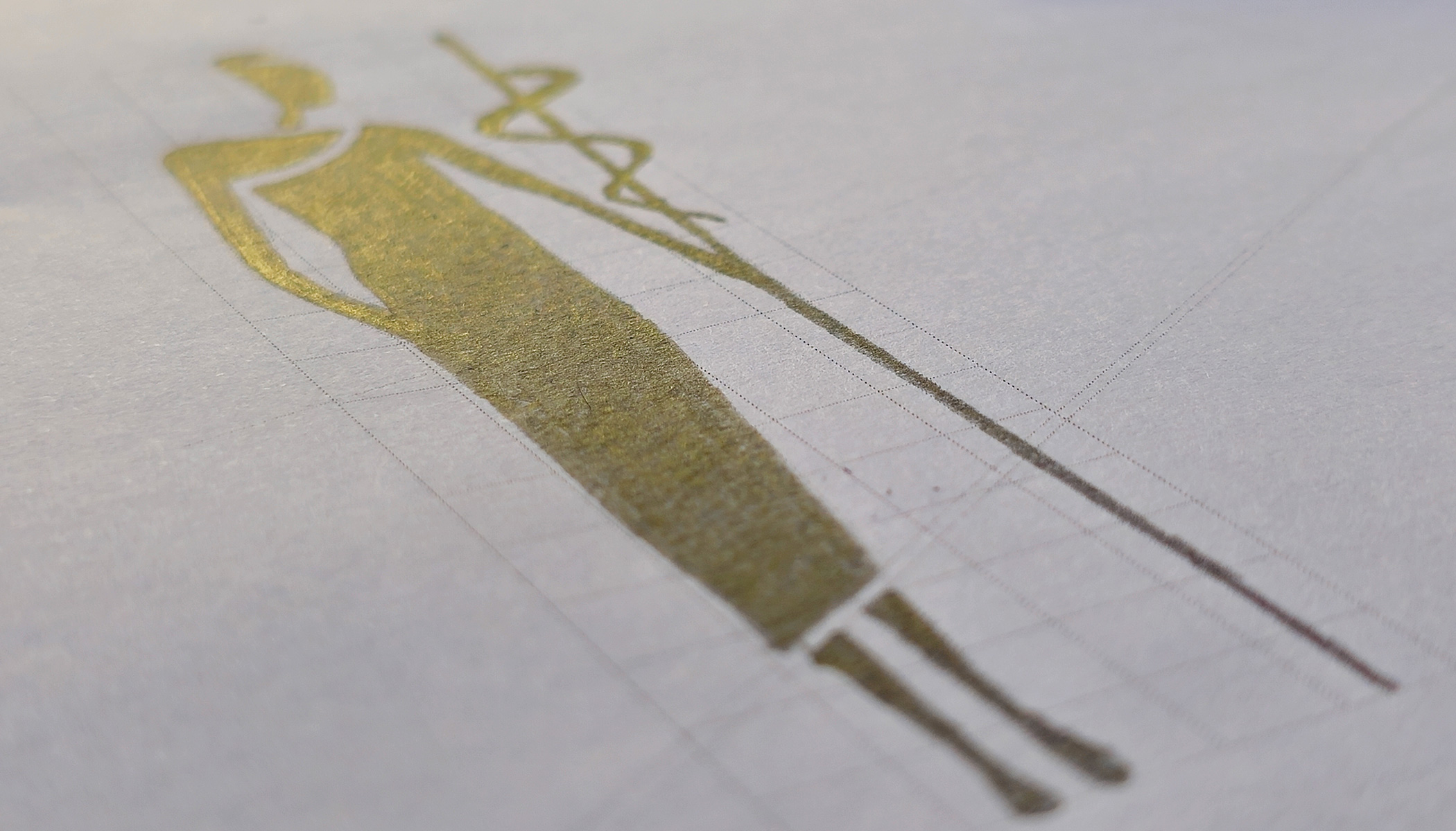
Early drawings were used to test the relationship between the external form, internal negative space and the medical reference. The mark was progressively simplified until the individual elements became one coherent symbol rather than an assembly of visual signs.

Early concept drawings for the Africa Health ExCon logo
Final development sketch of the Africa Health ExCon symbol

Designed to work beyond the page

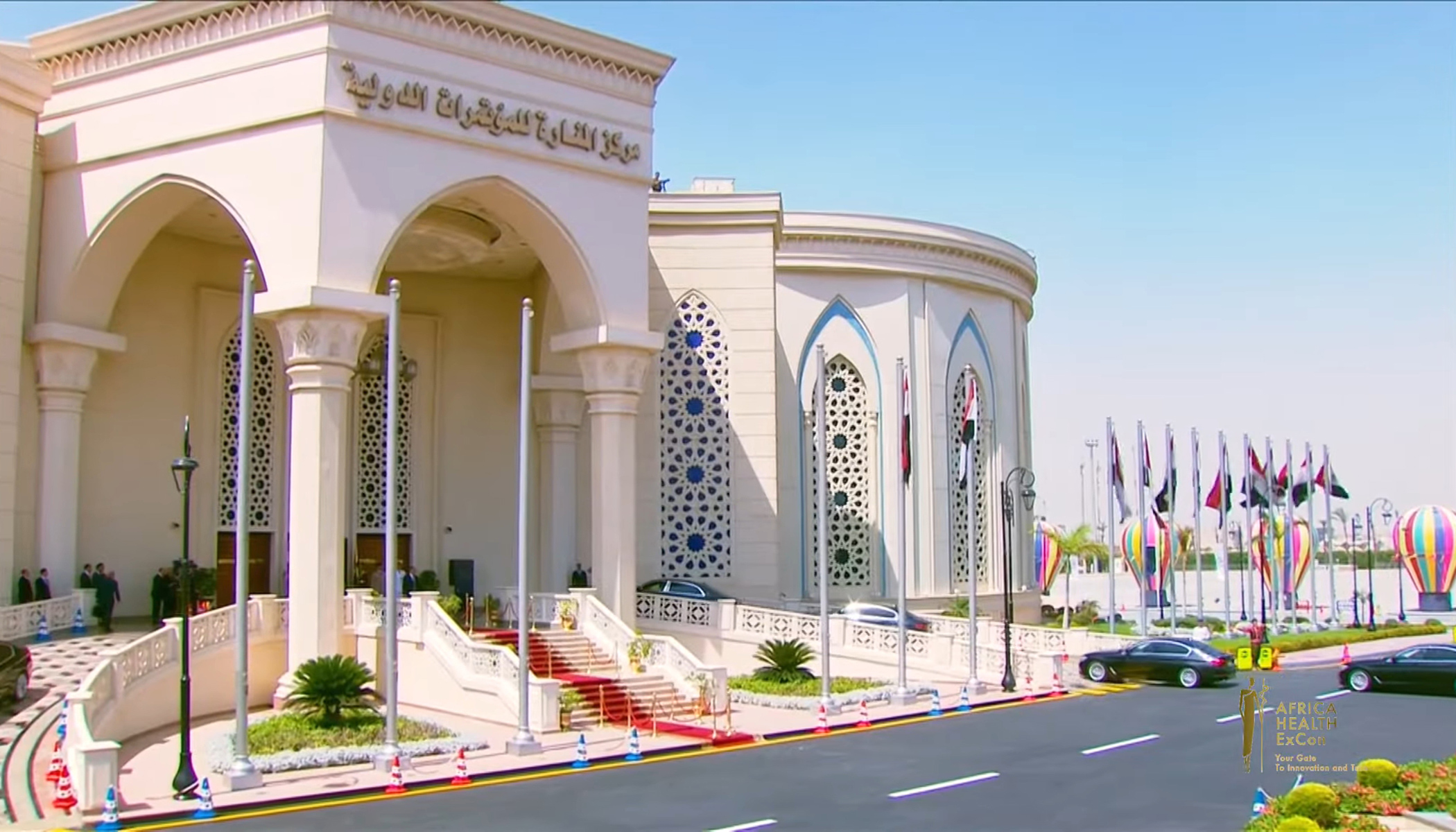
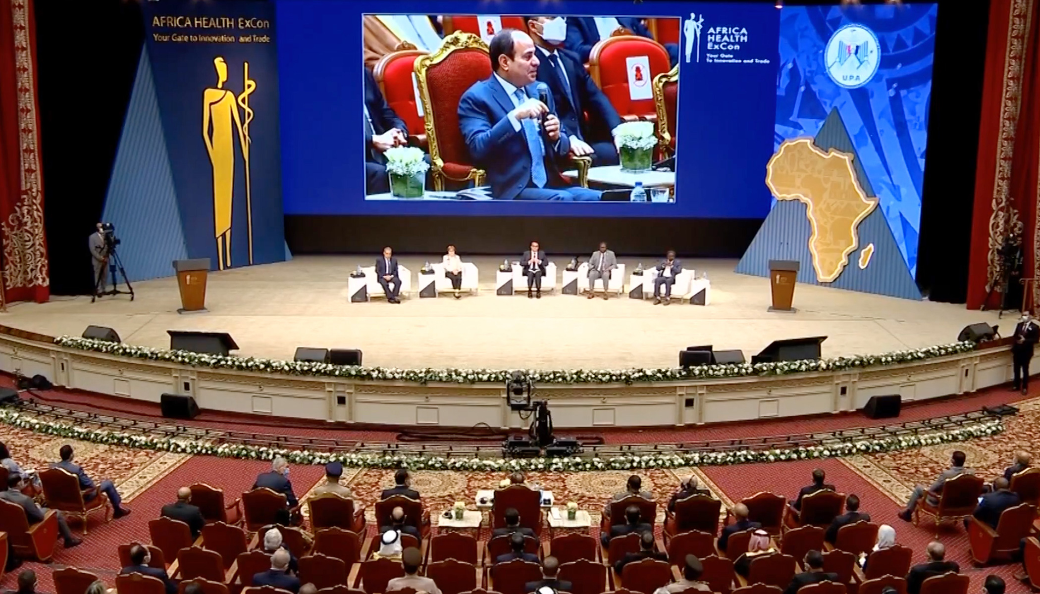
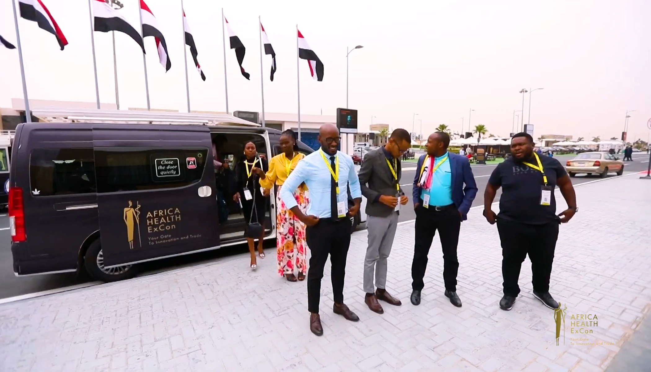
The real test of the identity was its ability to operate at the scale of the event itself. The mark remained recognisable when reproduced on screens, printed communication, flags, vehicles, stage environments, exhibition structures and large exterior signage.

Its compact form made it possible to maintain visual consistency across these very different formats while allowing the wider event communication to change from one application to another.

From symbol to public presence

Across the event environment, the logo became more than an identifying graphic. Repetition, scale and three-dimensional applications transformed it into a visible point of orientation and a unifying element for the entire experience.

The photographs below show how the mark moved from the original drawing into a large international healthcare event, retaining its clarity in both close detail and architectural scale.

Role and scope

Logo concept and design
Symbol development
Drawing and refinement
Core visual direction
Application principles

La Femmina wine bottle for Zonin with female symbol, overlapping colour and gold foil

La Femmina Wine Label Design for Zonin

Created for the US market in collaboration with the Miami-based agency Man-Super for Zonin, La Femmina is built around a direct symbolic identity. The female symbol becomes both the name and the principal visual device, constructed through overlapping colour, gold foil and the deep black surface of the bottle. Its scale and simplicity give the packaging immediate recognition while maintaining a restrained premium character. The capsule extends the concept through a complementary male symbol oriented towards the female mark, introducing a subtle secondary narrative without competing with the clarity of the front design.

“Dream Hunter”: A Tribute to Modern Artistry

“Dream Hunter” is dedicated to a contemporary artist and their masterpiece, the Dream Hunter statue. This label is designed for a young, modern wine that captures the spirit of creativity and the pursuit of dreams.

As a Pinot Grigio, “Dream Hunter” embodies the vibrant and refreshing qualities of this varietal. Its crisp acidity and light, fruity notes make it the perfect companion for those who chase their dreams and embrace modern elegance.

Raise a glass to inspiration and creativity!