Tenuta Baiamonte packaging system for Pietra di Mamma, Mamma Tempesta and Mamma Ombra

Tenuta Baiamonte Brand Identity and Wine Packaging

A volcanic identity for three wines from Etna

Tenuta Baiamonte is a boutique winery on the north slope of Mount Etna in Sicily, at 959 metres above sea level. The commission was to create the identity and packaging for an emerging estate and its initial three-wine range: Grecanico, Nerello Mascalese and Grenache.

The challenge was not simply to make another volcanic label. It was to give a small premium producer one recognisable voice, while allowing each wine to express a different character.

From research to a coherent brand system

The work began with the estate brief, competitor review, varietal research and brand positioning. The intended character was authentic, elegant, premium, timeless and distinctive, with a contemporary expression of Etna rather than a literal illustration of the volcano.

duskodesign developed the strategic direction, brand mark, wine names and the complete packaging system.

Etna as mother, not as postcard

The central idea was Mamma Etna, understood as a maternal presence that can nurture and renew, but also cast shadow and release great force. This tension created a more distinctive territory than the familiar postcard image of a volcano.

The three final names became different expressions of the same source: Pietra di Mamma, Mamma Tempesta and Mamma Ombra. Volcanic stone imagery gives each wine a geological portrait, while the names introduce emotion and character.

A mark oriented to the north

The Baiamonte mark combines a reduced profile of Etna, a north marker and a crown-like crest. It connects the estate’s position on the north slope with the sense of distinction required for a boutique winery.

Restrained typography keeps the system contemporary and allows the stone imagery to remain central across labels, capsules and corporate applications.

Tenuta Baiamonte logo printed on textured paper

One family, three characters

All three labels share the same white field, typography, layout and Baiamonte signature. The stone changes with the wine, creating individual characters within one recognisable family.

Pietra di Mamma

For the Grecanico, Pietra di Mamma uses an ochre-covered volcanic stone. Its warm mineral surface gives the white wine a tactile identity while retaining the lightest presence in the range.

Pietra di Mamma Grecanico bottle with ochre volcanic stone label
Pietra di Mamma label detail with ochre volcanic stone

Mamma Tempesta

Created for the Nerello Mascalese, Mamma Tempesta uses an irregular fragment of dark lava. Small details selected in gold bring light and value to the raw geological surface, making this the most forceful expression in the family.

Mamma Tempesta Nerello Mascalese bottle with dark lava label
Mamma Tempesta label detail with gold accents on dark lava

Mamma Ombra

For the Grenache, Mamma Ombra is represented by a smooth black stone crossed by a fine gold incision. Its reduced form creates the quietest and most enigmatic character of the three wines.

Mamma Ombra Grenache bottle with smooth black volcanic stone label

Material detail without excess

The production system was specified around white label stocks, black and grey inks, a controlled red accent and Kurz 429 gold foil. The capsule designs continue the volcanic imagery beyond the front label, giving the bottles a coherent presence from closure to base.

Tenuta Baiamonte logo, colour palette and production specifications

From concept to print

duskodesign developed the research, positioning, wine naming, brand identity and complete packaging system. The production scope included front and back labels for three wines, capsule design, colour and foil specifications, print-ready artwork and technical preparation for printing.

The result is one coherent identity with three individual characters, all connected to the same estate and the same mountain.

“Leonessa”: The Queen of Vine & the premium packaging design.


A visual homage to quiet power and essential form.

Designed for a unique rosé born from the native Foglia Tonda grape, “Leonessa” embraces simplicity with symbolic depth. At the center of the design is the astrological symbol for Leo—gently rotated and reimagined.

The original circle, once positioned below, now rises to the top, becoming the lioness’s head. A subtle crown rests above, while the curve extending downward transforms into a tail, completing the graceful silhouette.

This symbol is not printed—but cut. A delicate incision through the label reveals the wine itself, allowing the rosé’s natural color to emerge as an integral part of the visual identity. The result is a quiet dialogue between material, symbol, and substance.

“Leonessa” is not about noise. It is about presence. A design that lets the wine speak for itself—through light, color, and line.

Rosso di Leo – An Exclusive Concept Tribute to Tuscan Wine

Rosso di Leo is an exclusive concept in wine label design, developed as a tribute to a special limited-edition Tuscan wine.

Crafted using drops of the vibrant “Foglia Tonda” grape, each label becomes a unique piece of natural art. The wine itself is gently applied onto premium cotton paper, whose cross-fiber structure absorbs the liquid spectacularly, creating individual and organic patterns.

A secret recipe involving a natural antioxidant derived from Italian lemons helps preserve the color while allowing it to evolve over time—so the aging of the wine can be read directly from the label. This innovative technique makes each bottle not just a product, but a storytelling piece of design and craftsmanship.

Rosso di Leo showcases how design and nature can merge into truly unique packaging experiences.

“Primo di Leo”: The Little King of Wines

“Primo di Leo” is a concept specially developed to embody the essence of the vineyard and the brilliance of their first release. Named after the vineyard’s unique shape, which mirrors the Leo constellation, this wine symbolizes the Little King, inspired by Regulus, the constellation’s brightest star. Regulus shines as a brilliant white-blue star, standing out for its luminosity.

The wine is crafted from the beautiful “Foglia Tonda,” an ancient Italian grape known for its rich, full-bodied character and deep, vibrant flavors.

Experience the brilliance and elegance of “Primo di Leo.” Raise a glass to new beginnings and celestial inspiration!

Website & Photography

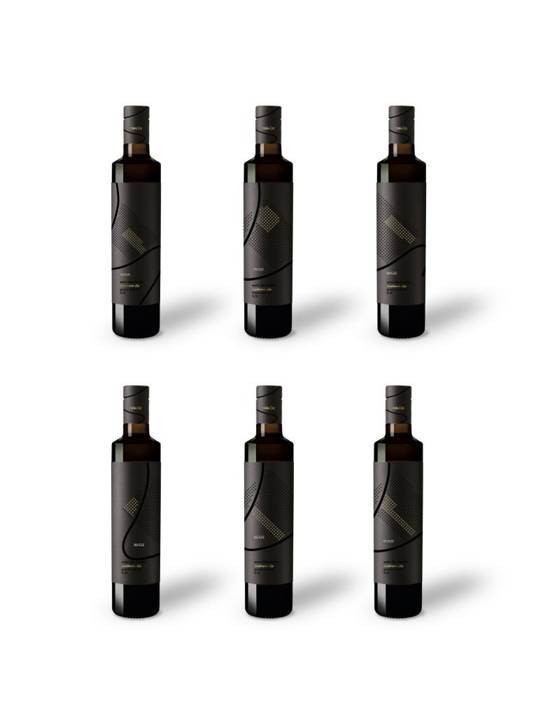
Six Rošulja olive oil bottles with individual grove-mapped labels

Rošulja Olive Oil Brand and Packaging Design
An identity mapped from the grove itself

Rošulja is a brand and packaging system created for a family olive grove on the island of Krk, Croatia.

Originally commissioned as a set of olive oil labels, the project grew through research and conversations with the client into a complete identity for an authentic island product. The aim was to create packaging that felt local without becoming folkloric, premium without becoming generic, and valuable enough to be taken home as a gift.

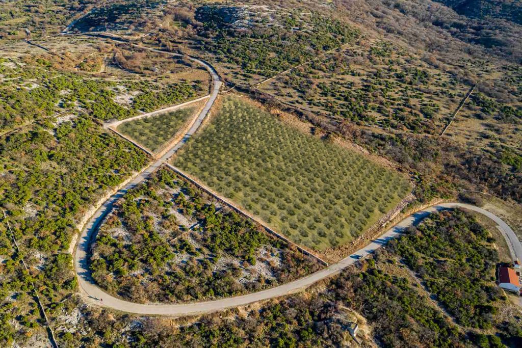
Rošulja olive grove tree distribution translated into olive oil label design

Every label is a precise map of origin

The actual outline of the grove and the S-shaped road that crosses it became the structure of the identity. Instead of using a generic symbol of olive oil, the packaging is built from the precise geography of Rošulja.

Every circle represents a real olive tree. Gold circles mark the actual position of the trees belonging to the variety inside that bottle, while the remaining trees stay black. References such as 102/525 state the number of trees of that cultivar in relation to the total number in the grove.

This turns every label into a precise map of origin.

Rošulja olive oil bottles with black and gold foil labels

One grove, six individual oils

The client had planned several olive varieties, but the idea of giving each variety its own label was developed as part of the design strategy. All six labels share the same structure, typography and grove outline, while the gold pattern changes according to the actual distribution of each cultivar.

Together they form one coherent family. Individually, each bottle carries its own map. A restrained black base moves the product away from conventional rustic packaging, while gold foil and transparent varnish give the surface depth and material value.

Four Rošulja olive oil bottles with individual varietal label designs

From strategy to production

duskodesign developed the research, positioning, creative direction, brand identity and complete packaging system. The work included the selection of paper, gold foil and transparent varnish, print-ready artwork, and direct production coordination with the Croatian printer recommended by the client.

The bottle had already been selected by the client. Everything else, from the visual strategy and six-label system to the final production files, was developed and managed by duskodesign.

Independent recognition

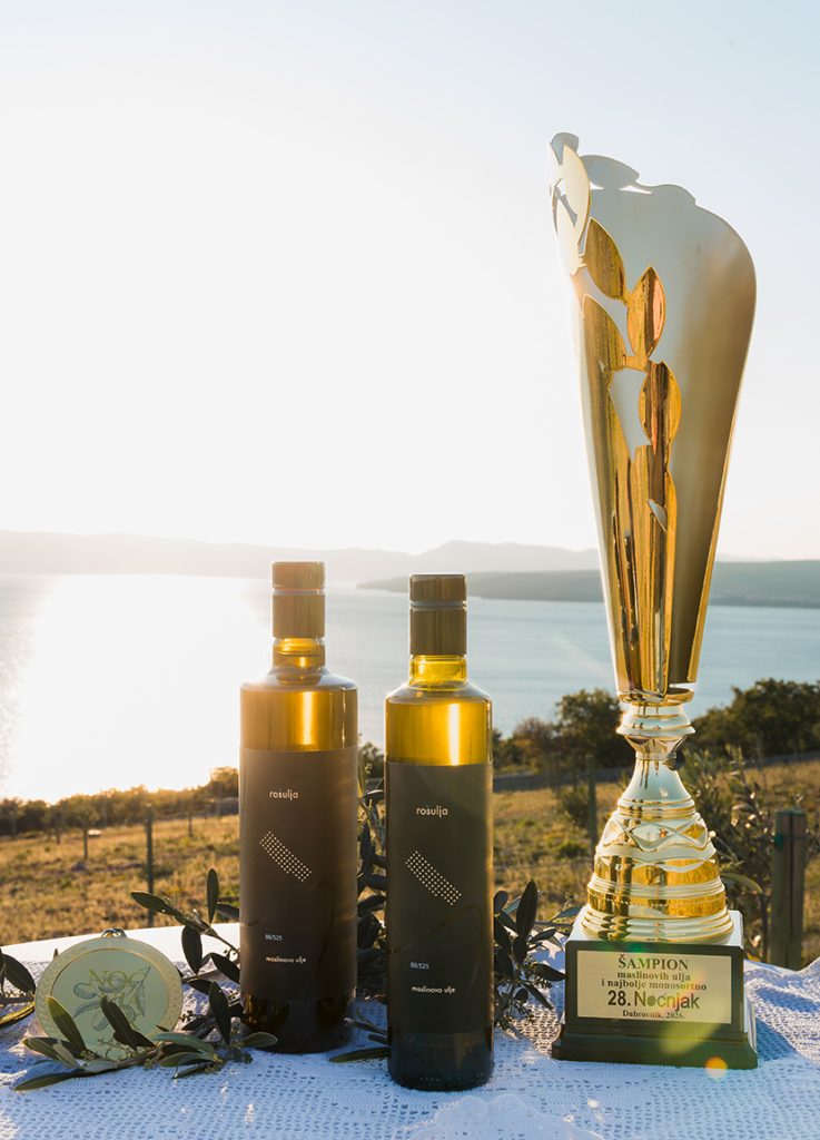
At Noćnjak 2026, OPG Rošulja, Roko Šulina, received the title Champion for packaging quality and best monovarietal extra virgin olive oil for its Oblica oil.

The recognition connected the quality of the product with the quality of its presentation, confirming the central idea of the project: an authentic island oil expressed through a packaging system grounded in its real place of origin.

Rošulja olive oil bottles with the Noćnjak 2026 Champion trophy

Dieci e Mezzo

The name “Dieci e Mezzo” “10 1/2” reflects the wine’s alcohol content, emphasizing its delightful lightness. This wine’s lower alcohol content is mirrored in its slender label design. Applying such a thin label perfectly on the bottle was a challenging task, but it ensures that “Dieci e Mezzo” stands out on a crowded shelf.

The unique and delicate label immediately conveys the wine’s character and lightness, attracting the intended audience with its elegance and simplicity.

Experience the refreshing lightness of “Dieci e Mezzo 10 1/2” and discover a new favorite for any occasion. Cheers to refined simplicity!

Introducing “La Femmina”: A Celebration of Empowerment and Elegance

Crafted for the US market in collaboration with the Miami-based advertising agency “Man-Super” for one of Italy’s most esteemed wine brands, Zonin, “La Femmina” is more than just a beautiful bottle; it embodies quality and excellence in winemaking.

The design of “La Femmina” is a study in minimalism and symbolic power. The label is dominated by the elegant and commanding presence of the female symbol, celebrating the essence of femininity and its vital role. This striking visual is intended to honor the strength, grace, and influence of women, making it a standout piece on any wine lover’s shelf.

On the capsule, the male symbol is oriented towards the female symbol, representing harmony and mutual respect between genders. This detail adds a unique and thoughtful twist to the design.

Experience the elegance and strength of “La Femmina” with each sip. Cheers to empowerment and sophistication!

“Dream Hunter”: A Tribute to Modern Artistry

“Dream Hunter” is dedicated to a contemporary artist and their masterpiece, the Dream Hunter statue. This label is designed for a young, modern wine that captures the spirit of creativity and the pursuit of dreams.

As a Pinot Grigio, “Dream Hunter” embodies the vibrant and refreshing qualities of this varietal. Its crisp acidity and light, fruity notes make it the perfect companion for those who chase their dreams and embrace modern elegance.

Raise a glass to inspiration and creativity!

Sizzilla

Nero d’Avola and Cabernet Sauvignon: A Fusion of Sicily’s Dual Souls

Nero d’Avola and Cabernet Sauvignon come together to create a wine that embodies the two souls of Sicily. This region is renowned for its exceptional native grapes like Nero d’Avola and has also embraced international varieties like Cabernet Sauvignon with great success.

“Riserva” Fattoria Casenuove

“Riserva” represents the pinnacle of excellence at Fattoria Casenuove, showcasing their finest Sangiovese. The label design incorporates traditional imagery essential for such a prestigious and traditional wine. However, it transforms the traditional illustration into a background visible only with the right light angle.

This wine is serious yet imbued with new strength and energy, reflecting the vision of the new owner.


Casenuove / The Redesigned Chianti Classico: A Modern Take on Tradition

Chianti Classico, Gallo Nero, is crafted from Sangiovese grapes and is renowned for its full-bodied character and rich history. Reflecting the wine’s robust nature, label is redesigned to be bold and substantial, incorporating illustrations from the historical label. This modern refresh aligns with the company’s new direction while honouring its storied past.


Introducing “Il Codibugnolo”: Light and Playful Elegance

“Il Codibugnolo” is the lightest and most playful wine from the Fattoria Casenuove winery. The owner wanted to feature this beautiful bird with a complex design that initially contrasted with the wine’s character. This project exemplifies the need to balance initial ideas with effective communication.

The final design strikes this balance, perfectly capturing the essence of “Il Codibugnolo” while ensuring the label communicates its lighthearted nature.

“Anfiteatro” Vecchie Terre di Montefili

“Anfiteatro” stands as one of Panzano, Chianti’s most esteemed wines, steeped in tradition and significance. The redesign endeavours to simplify while maintaining the well-known traditional imagery, striking a delicate balance among its various elements.

Experience the essence of tradition and innovation, cheers to heritage and refined craftsmanship!

Branding, Logo Design, Web Design e Fotografia per Agriturismo La Torre di San Martino di Panzano in Chianti

I am pleased to have collaborated with Agriturismo La Torre di San Martino di Panzano, located in the heart of one of the most beautiful landscapes in the world (the Tuscan landscape, with its rolling hills, vineyards, and olive groves): Tuscany.

Branding / Web Design / Photography

This collaboration has allowed us to best enhance Agriturismo La Torre di San Martino di Panzano, creating a coherent and captivating image that attracts and inspires visitors, offering them a taste of the beauty and tranquility of Tuscany.

http://www.latorredisanmartino.it/home

Azienda Agricola Amantis

Amantis is a family story, a young project rooted in an ancient love for the land and wine. This commitment began with the search for the ideal terroir, where they could create wines that embody their passion, dedication, and humanity.

For this project, I designed the website and captured the photographs, aiming to reflect the spirit and beauty of Amantis and its extraordinary surroundings.


Designing the Africa Health ExCon Logo

The Africa Health ExCon is a significant, one of the biggest events in the healthcare sector that focuses on promoting and advancing healthcare in Africa. I am honored to have designed the logo for this prestigious event, capturing its essence and mission.

Concept and Inspiration

The Africa Health ExCon logo embodies the spirit of unity, innovation, and progress in healthcare. The design draws inspiration from Africa’s rich cultural heritage.

A Glimpse Behind the Scenes

Here is a sketch from the early stages of the design process, showcasing the initial concept that evolved into the final logo.

A sketch from the last stages of the design process.

Visual Showcase

Explore the video below to see the logo in various applications and contexts, highlighting its versatility and impact.

Graphical Interface Design for Italray Radiological Equipment

I had the privilege of collaborating with Italray, a leading company in the production of 100% Made in Italy radiological equipment, for the design of the graphical interface display of their digital radiological solutions. Working closely with the Italray team, I developed an intuitive and advanced GUI, designed to optimize the user experience and ensure efficient and safe use of the equipment in various medical settings, from hospital departments to installations in diverse environments. The attention to detail and usability has allowed us to create an interface that reflects the innovation and tradition that have distinguished Italray for 45 years.

Typeface & Font DNA / Typography Book & Stencil

TYPEFACE & FONT DNA is a historical-theoretical and practical research dedicated to one of the most important discoveries in history, aimed at providing reference points for future Italian visual communication designers who face themes related or indirectly related to the topic.

The project is divided into three main sections. The first section offers a historical overview of the transformations in the concept of transmitting messages in its visual form using the invention of writing.

The second section analyzes typefaces by taking as a reference one of the most iconic forms of Roman monumental writing, comparing it with the lapidary forms present in one of the Florentine churches. By analyzing, comparing, and seeking a universal reference point responsible for the evolution of typographic form up to the present day.

The third part aims to design and create a tool that encompasses all the typographic rules necessary to develop a typeface, in an intuitive but not too obvious way, with the aim of educating future designers who are blinded by technological disposition and artificial intelligence.