brand identity

Tenuta Baiamonte packaging system for Pietra di Mamma, Mamma Tempesta and Mamma Ombra

Tenuta Baiamonte Brand Identity and Wine Packaging

A volcanic identity for three wines from Etna

Tenuta Baiamonte is a boutique winery on the north slope of Mount Etna in Sicily, at 959 metres above sea level. The commission was to create the identity and packaging for an emerging estate and its initial three-wine range: Grecanico, Nerello Mascalese and Grenache.

The challenge was not simply to make another volcanic label. It was to give a small premium producer one recognisable voice, while allowing each wine to express a different character.

From research to a coherent brand system

The work began with the estate brief, competitor review, varietal research and brand positioning. The intended character was authentic, elegant, premium, timeless and distinctive, with a contemporary expression of Etna rather than a literal illustration of the volcano.

duskodesign developed the strategic direction, brand mark, wine names and the complete packaging system.

Etna as mother, not as postcard

The central idea was Mamma Etna, understood as a maternal presence that can nurture and renew, but also cast shadow and release great force. This tension created a more distinctive territory than the familiar postcard image of a volcano.

The three final names became different expressions of the same source: Pietra di Mamma, Mamma Tempesta and Mamma Ombra. Volcanic stone imagery gives each wine a geological portrait, while the names introduce emotion and character.

A mark oriented to the north

The Baiamonte mark combines a reduced profile of Etna, a north marker and a crown-like crest. It connects the estate’s position on the north slope with the sense of distinction required for a boutique winery.

Restrained typography keeps the system contemporary and allows the stone imagery to remain central across labels, capsules and corporate applications.

Tenuta Baiamonte logo printed on textured paper

One family, three characters

All three labels share the same white field, typography, layout and Baiamonte signature. The stone changes with the wine, creating individual characters within one recognisable family.

Pietra di Mamma

For the Grecanico, Pietra di Mamma uses an ochre-covered volcanic stone. Its warm mineral surface gives the white wine a tactile identity while retaining the lightest presence in the range.

Pietra di Mamma Grecanico bottle with ochre volcanic stone label
Pietra di Mamma label detail with ochre volcanic stone

Mamma Tempesta

Created for the Nerello Mascalese, Mamma Tempesta uses an irregular fragment of dark lava. Small details selected in gold bring light and value to the raw geological surface, making this the most forceful expression in the family.

Mamma Tempesta Nerello Mascalese bottle with dark lava label
Mamma Tempesta label detail with gold accents on dark lava

Mamma Ombra

For the Grenache, Mamma Ombra is represented by a smooth black stone crossed by a fine gold incision. Its reduced form creates the quietest and most enigmatic character of the three wines.
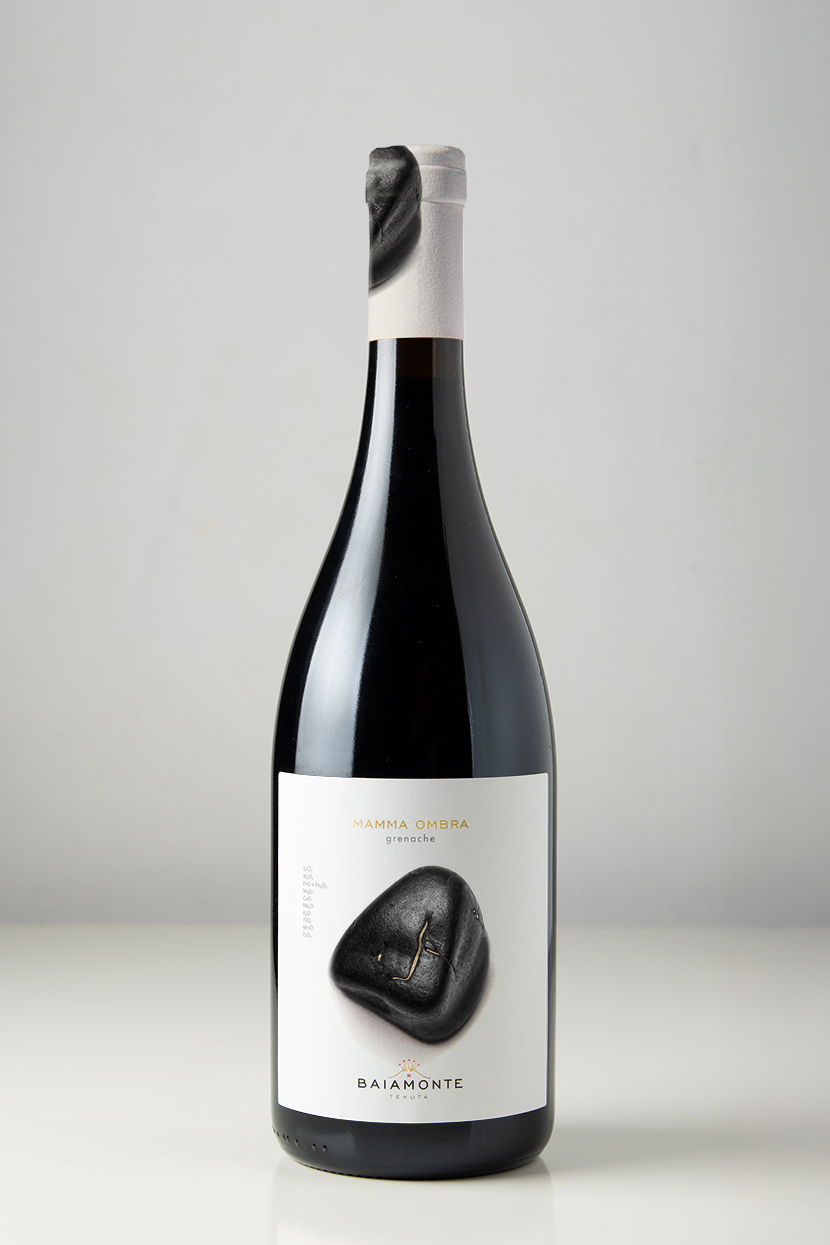
Mamma Ombra Grenache bottle with smooth black volcanic stone label

Material detail without excess

The production system was specified around white label stocks, black and grey inks, a controlled red accent and Kurz 429 gold foil. The capsule designs continue the volcanic imagery beyond the front label, giving the bottles a coherent presence from closure to base.

Tenuta Baiamonte logo, colour palette and production specifications

From concept to print

duskodesign developed the research, positioning, wine naming, brand identity and complete packaging system. The production scope included front and back labels for three wines, capsule design, colour and foil specifications, print-ready artwork and technical preparation for printing.

The result is one coherent identity with three individual characters, all connected to the same estate and the same mountain.
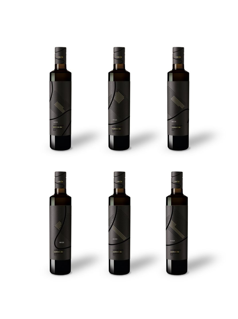
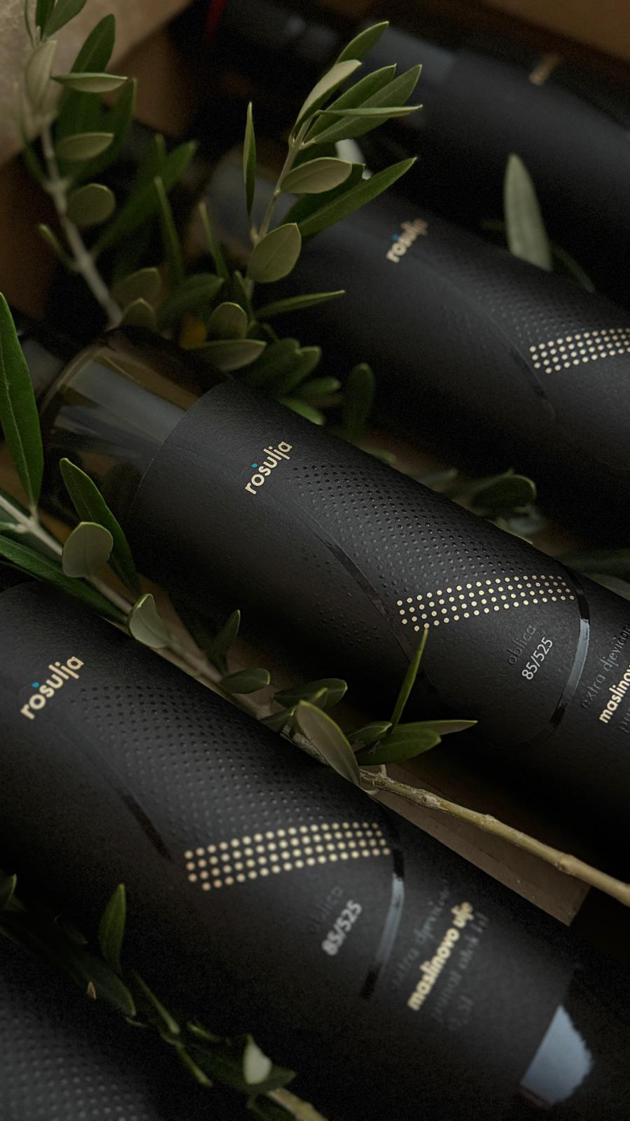
Six Rošulja olive oil bottles with individual grove-mapped labels

Rošulja Olive Oil Brand and Packaging Design

An identity mapped from the grove itself

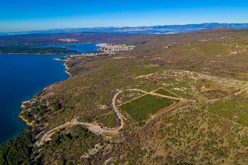
Rošulja is a brand and packaging system created for a family olive grove on the island of Krk, Croatia.

Originally commissioned as a set of olive oil labels, the project grew through research and conversations with the client into a complete identity for an authentic island product. The aim was to create packaging that felt local without becoming folkloric, premium without becoming generic, and valuable enough to be taken home as a gift.

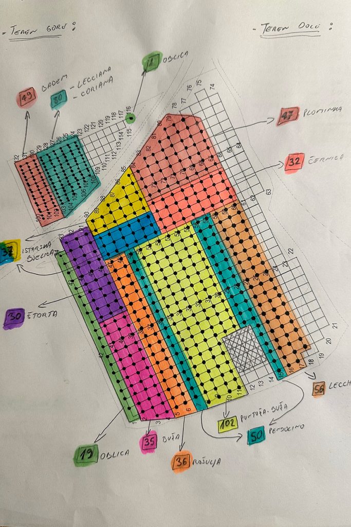
Rošulja olive grove tree distribution translated into olive oil label design

Every label is a precise map of origin

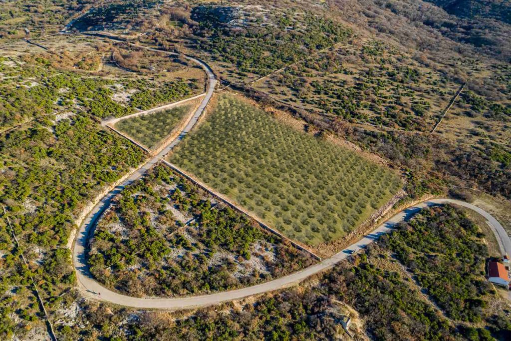
The actual outline of the grove and the S-shaped road that crosses it became the structure of the identity. Instead of using a generic symbol of olive oil, the packaging is built from the precise geography of Rošulja.

Every circle represents a real olive tree. Gold circles mark the actual position of the trees belonging to the variety inside that bottle, while the remaining trees stay black. References such as 102/525 state the number of trees of that cultivar in relation to the total number in the grove.

This turns every label into a precise map of origin.

Rošulja olive oil bottles with black and gold foil labels

One grove, six individual oils

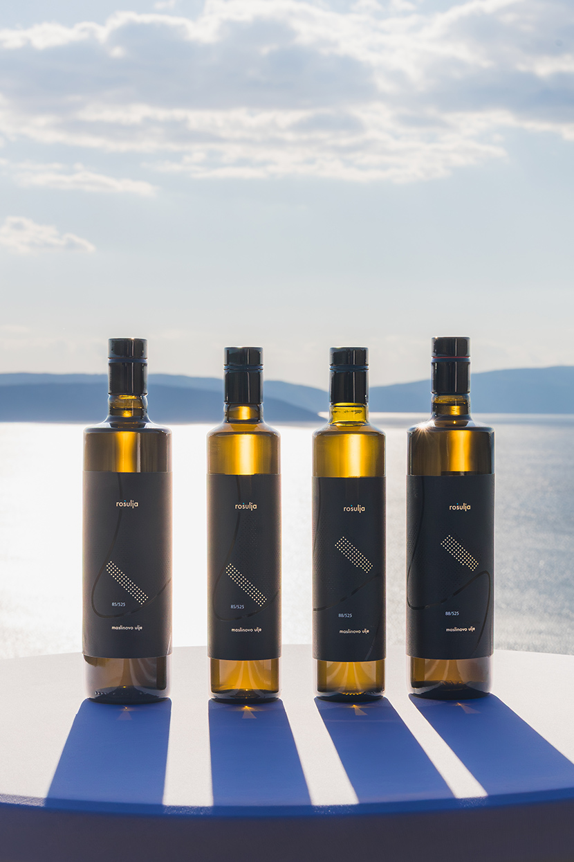
The client had planned several olive varieties, but the idea of giving each variety its own label was developed as part of the design strategy. All six labels share the same structure, typography and grove outline, while the gold pattern changes according to the actual distribution of each cultivar.

Together they form one coherent family. Individually, each bottle carries its own map. A restrained black base moves the product away from conventional rustic packaging, while gold foil and transparent varnish give the surface depth and material value.

Four Rošulja olive oil bottles with individual varietal label designs

From strategy to production

duskodesign developed the research, positioning, creative direction, brand identity and complete packaging system. The work included the selection of paper, gold foil and transparent varnish, print-ready artwork, and direct production coordination with the Croatian printer recommended by the client.

The bottle had already been selected by the client. Everything else, from the visual strategy and six-label system to the final production files, was developed and managed by duskodesign.

Independent recognition

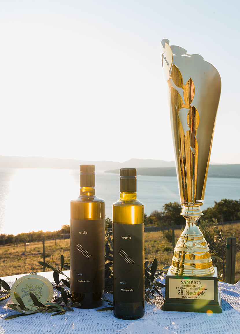
At Noćnjak 2026, OPG Rošulja, Roko Šulina, received the title Champion for packaging quality and best monovarietal extra virgin olive oil for its Oblica oil.

The recognition connected the quality of the product with the quality of its presentation, confirming the central idea of the project: an authentic island oil expressed through a packaging system grounded in its real place of origin.

Rošulja olive oil bottles with the Noćnjak 2026 Champion trophy