branding

Italray radiological equipment with touchscreen GUI designed by duskodesign

Italray Radiology GUI Design

Turning complex equipment states into a clear touchscreen interface

Italray asked duskodesign to develop the graphical interface for a radiology control console. The challenge was not simply to redesign a screen, but to organise a dense system of patient, examination, radiation and equipment movement information into an interface that could be understood at a glance.

The system also needed to adapt to different devices, configurations and operating conditions without losing consistency.

Designing the system before styling the screen

The work began with a detailed study of the requirements, an onsite examination of the equipment, user research and conversations with Italray’s product and technical team.

We mapped which information needed to remain visible, selectable, inactive or hidden across four principal console states, from examination selection to an open acquisition window. This established a clear hierarchy between primary actions, radiation parameters, mechanical movement controls, warnings and device status.

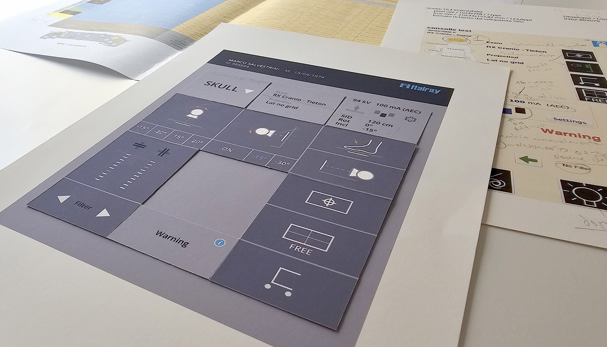
Information architecture and wireframes were then developed into a modular paper prototype. Movable elements made it possible to compare layouts and evaluate the relationships between controls, information and different equipment states before committing to the final visual design.
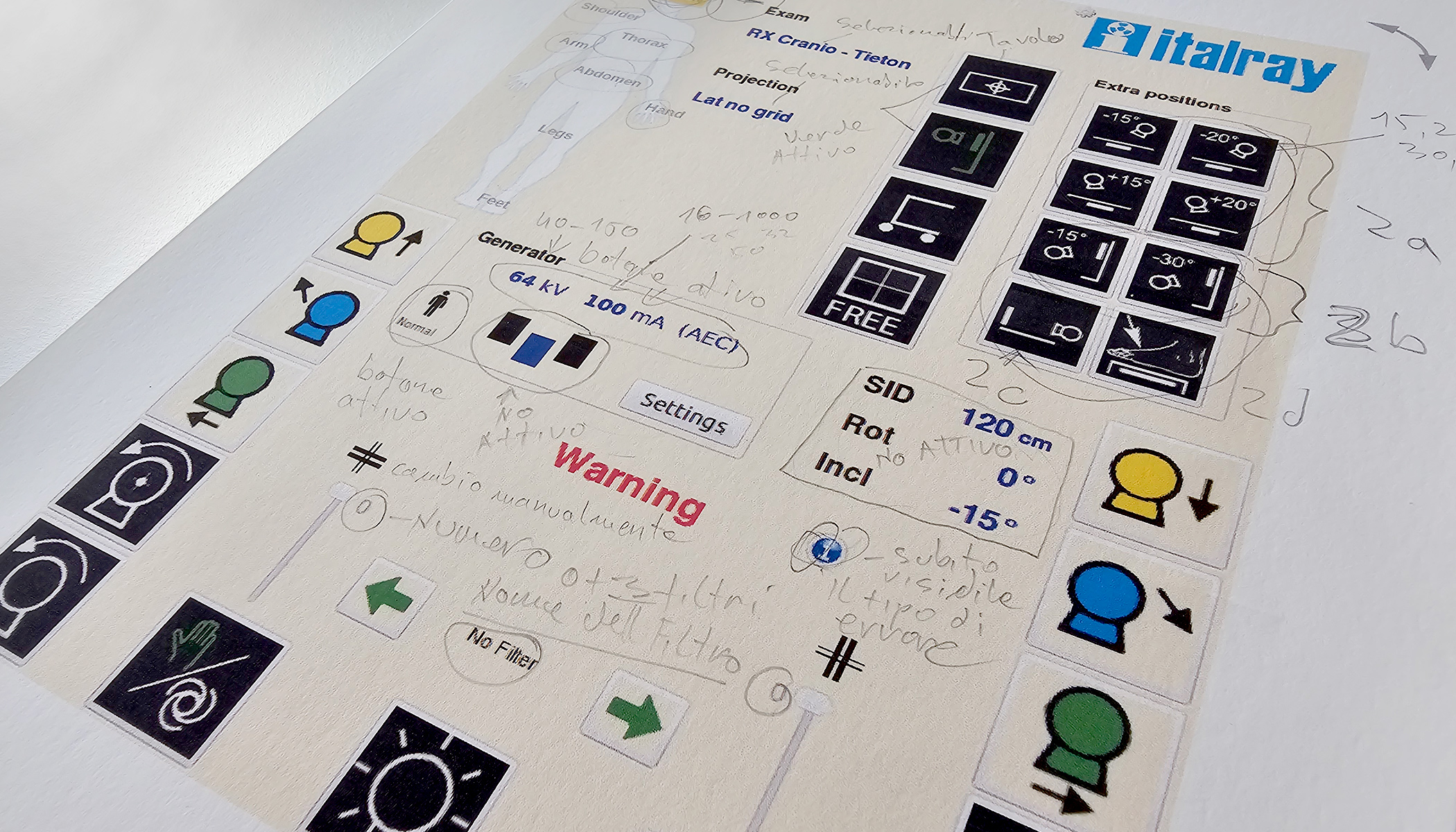
Early requirements and interface logic for the Italray radiology console
Requirements and early interface logic
Modular paper prototype developed for the Italray touchscreen interface
Modular paper prototype

From paper prototype to implemented equipment

The final interface uses a restrained visual system in which primary information, radiation data and mechanical movements are clearly differentiated. Active controls, selectable information and unavailable functions are organised through three distinct visibility levels.

The system was also designed to support different console formats, horizontal and vertical layouts, multilingual content, standardised radiology icons, warnings, error states and different equipment configurations.

Following iterative review and fine tuning with the Italray team, the final interface assets and implementation specifications were prepared for production. The resulting touchscreen system was implemented on Italray radiological equipment.
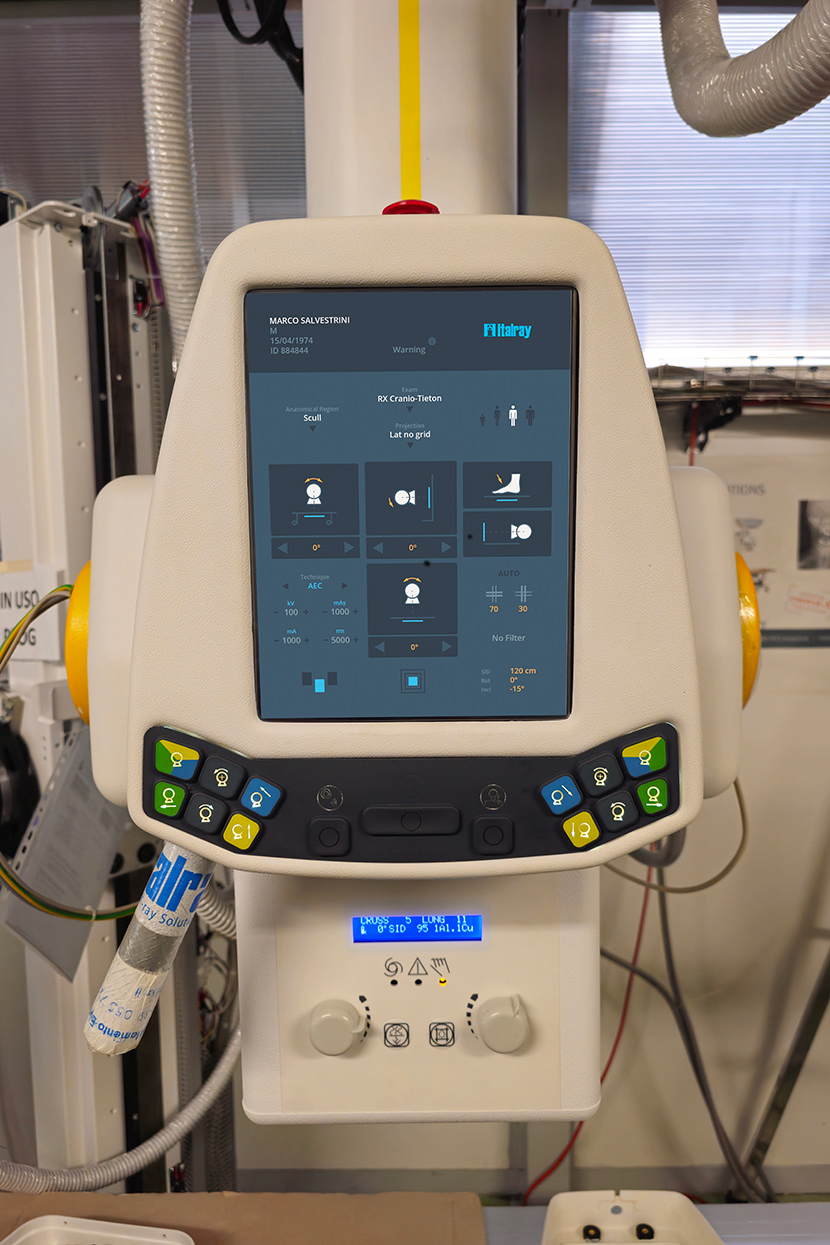
Italray radiological equipment with the implemented touchscreen interface designed by duskodesign

Role

duskodesign led the requirements analysis, user research, information architecture, wireframing, paper prototyping, UI design, interface system development, iterative refinement and production handoff in close collaboration with Italray’s product and technical team.

Services

UX Research, Information Architecture, Wireframing, Paper Prototyping, UI Design, Interface System, Production Handoff
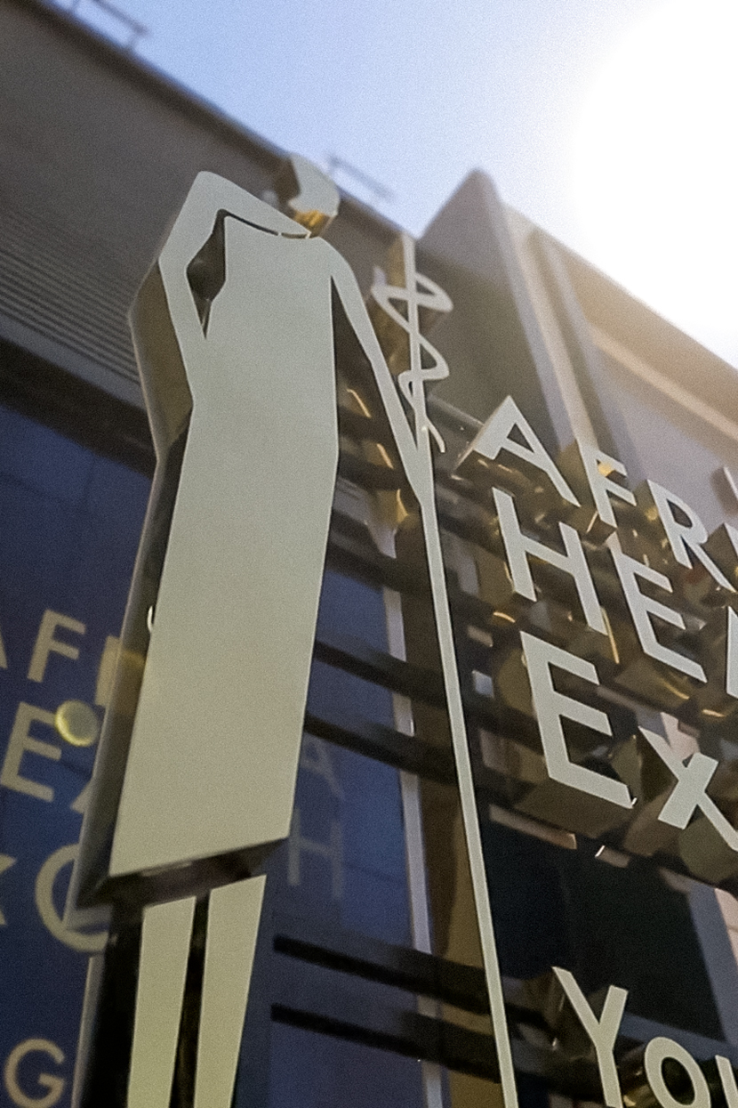
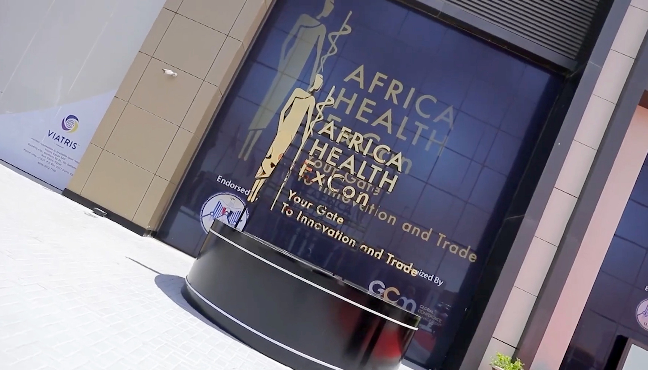
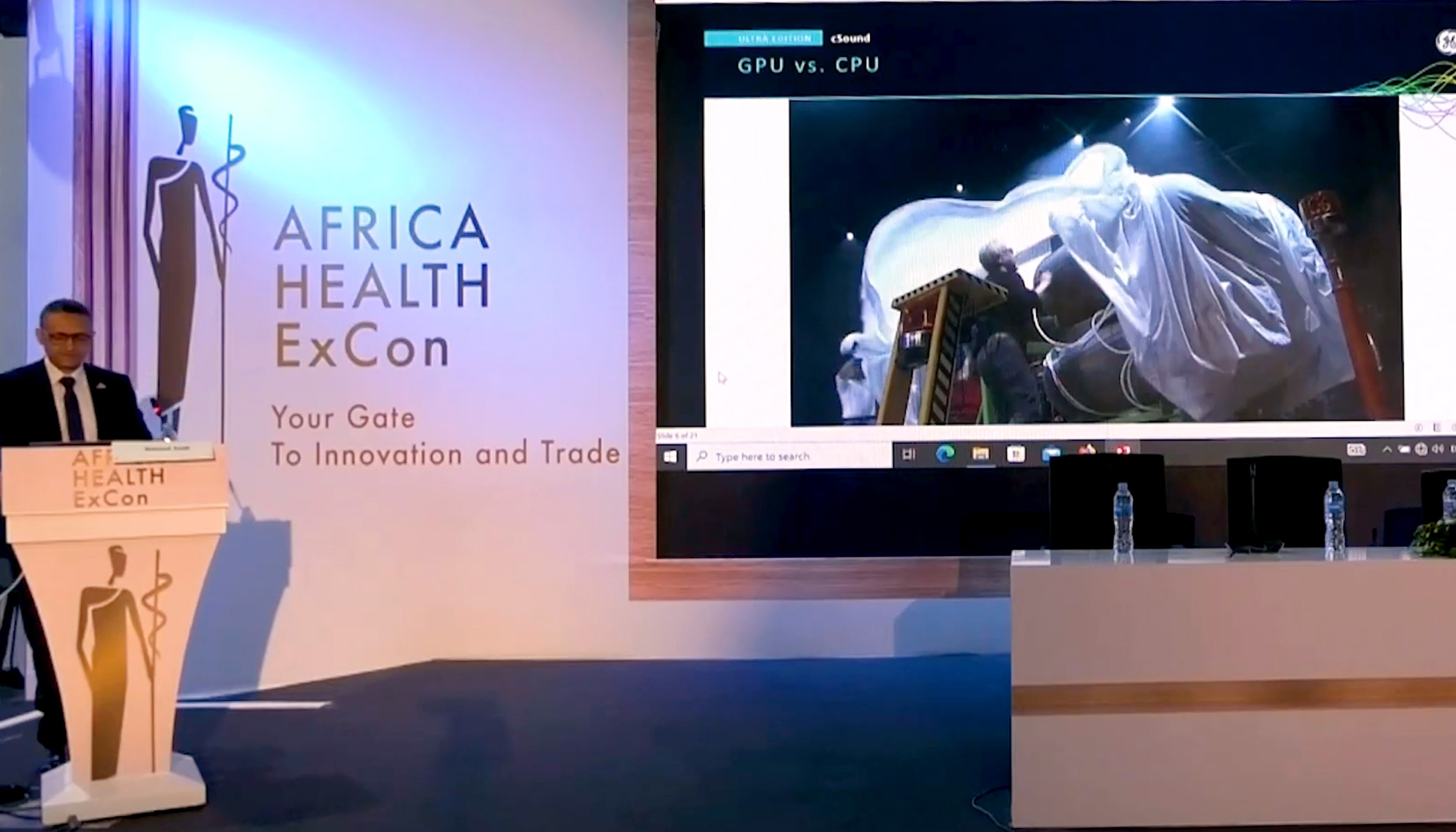
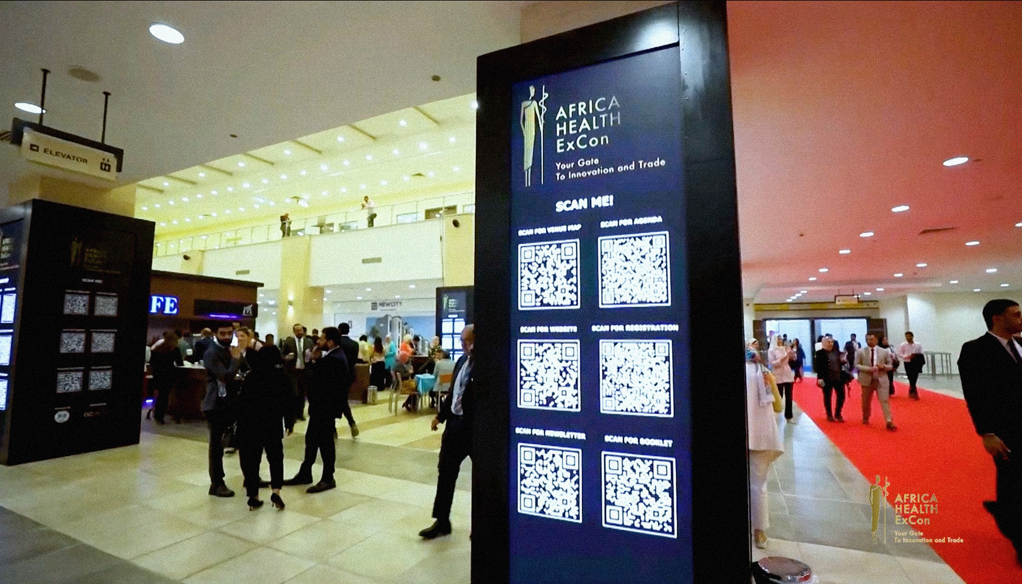
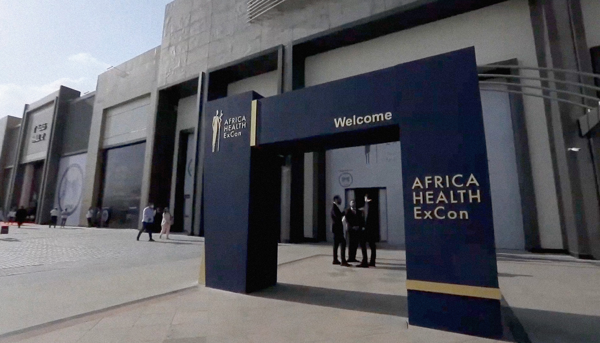
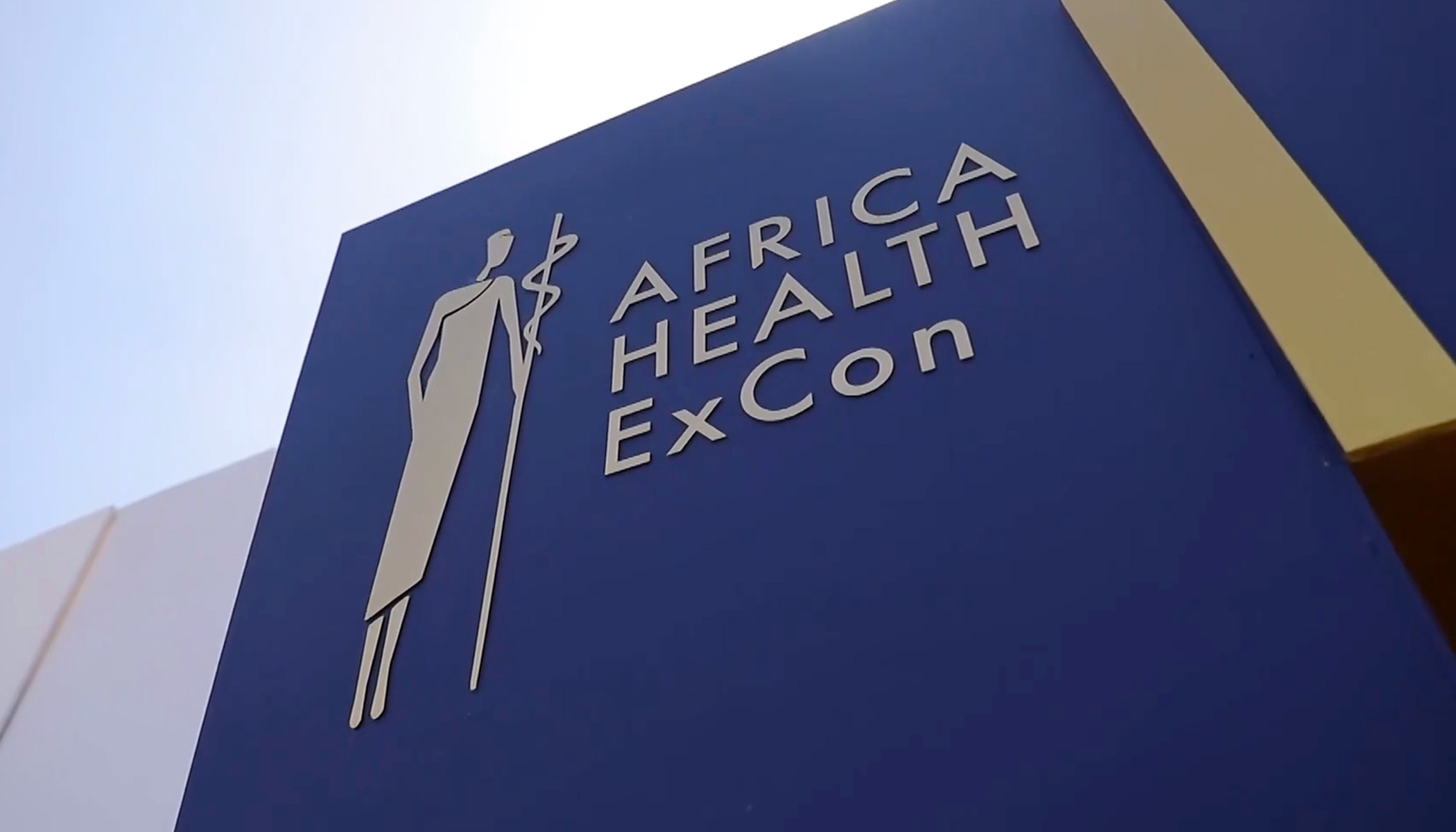
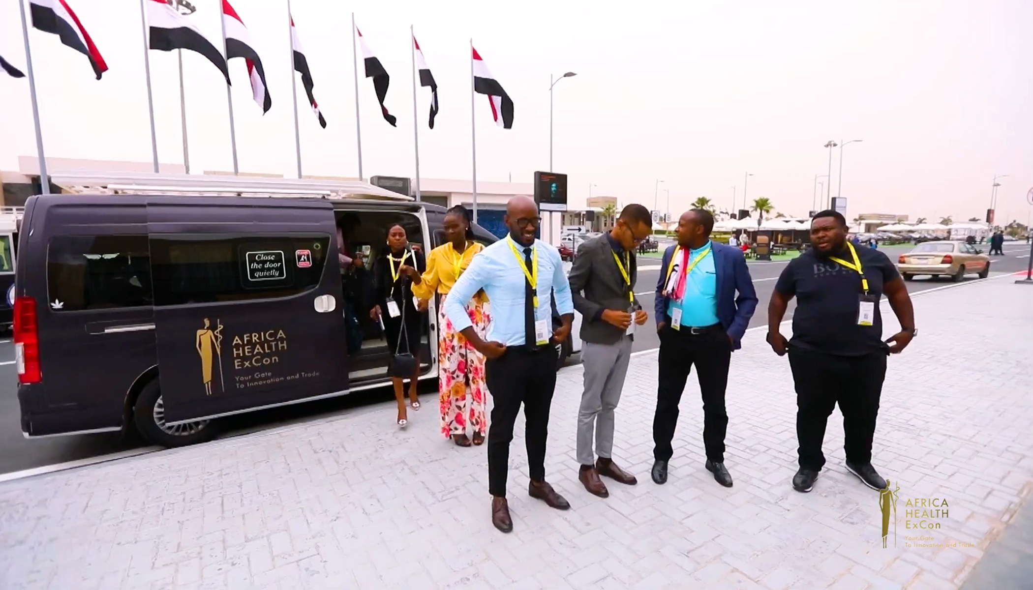
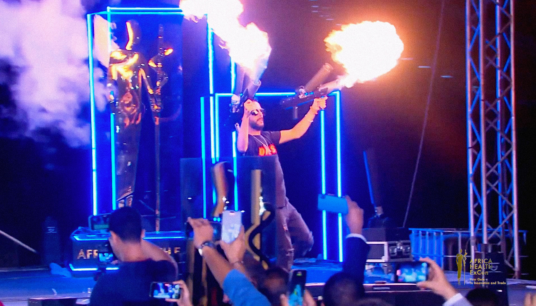
Designing the Africa Health ExCon Logo

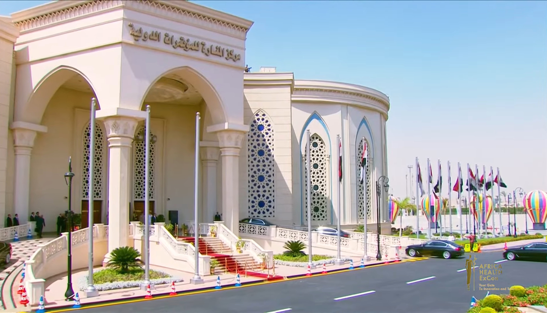
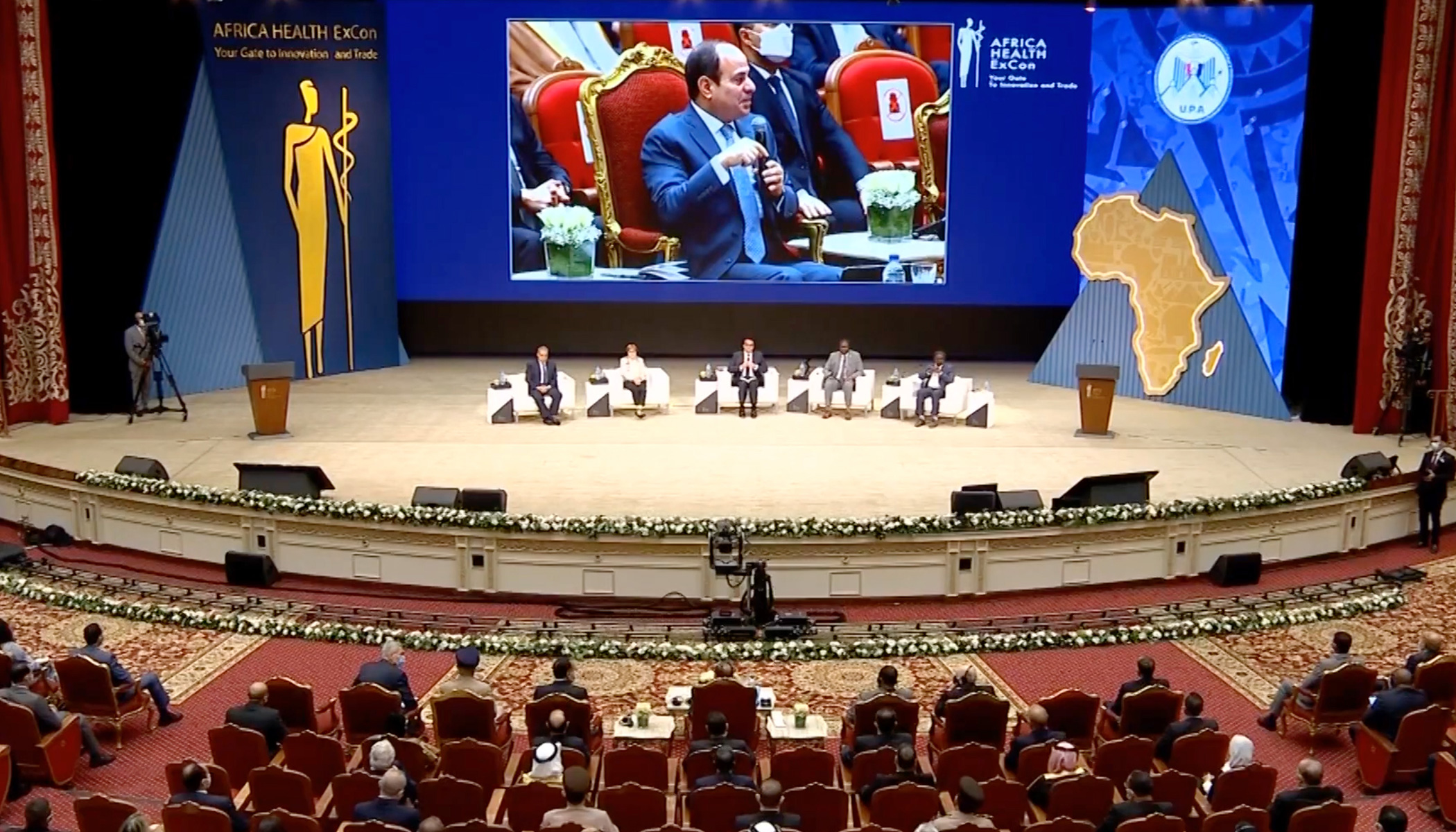
The Africa Health ExCon is a significant, one of the biggest events in the healthcare sector that focuses on promoting and advancing healthcare in Africa. I am honored to have designed the logo for this prestigious event, capturing its essence and mission.

Concept and Inspiration

The Africa Health ExCon logo embodies the spirit of unity, innovation, and progress in healthcare. The design draws inspiration from Africa’s rich cultural heritage.

A Glimpse Behind the Scenes

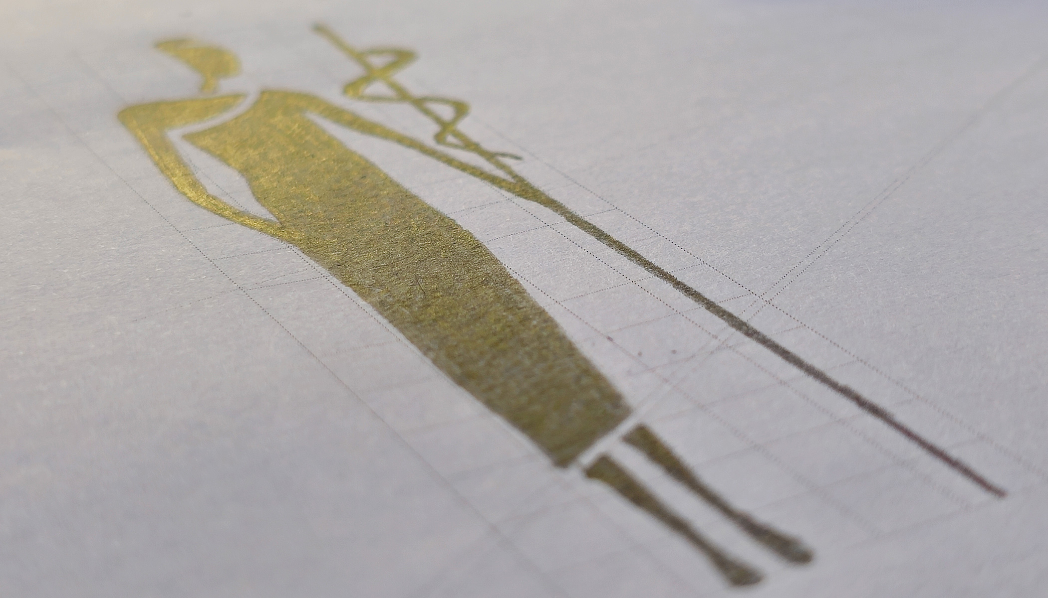
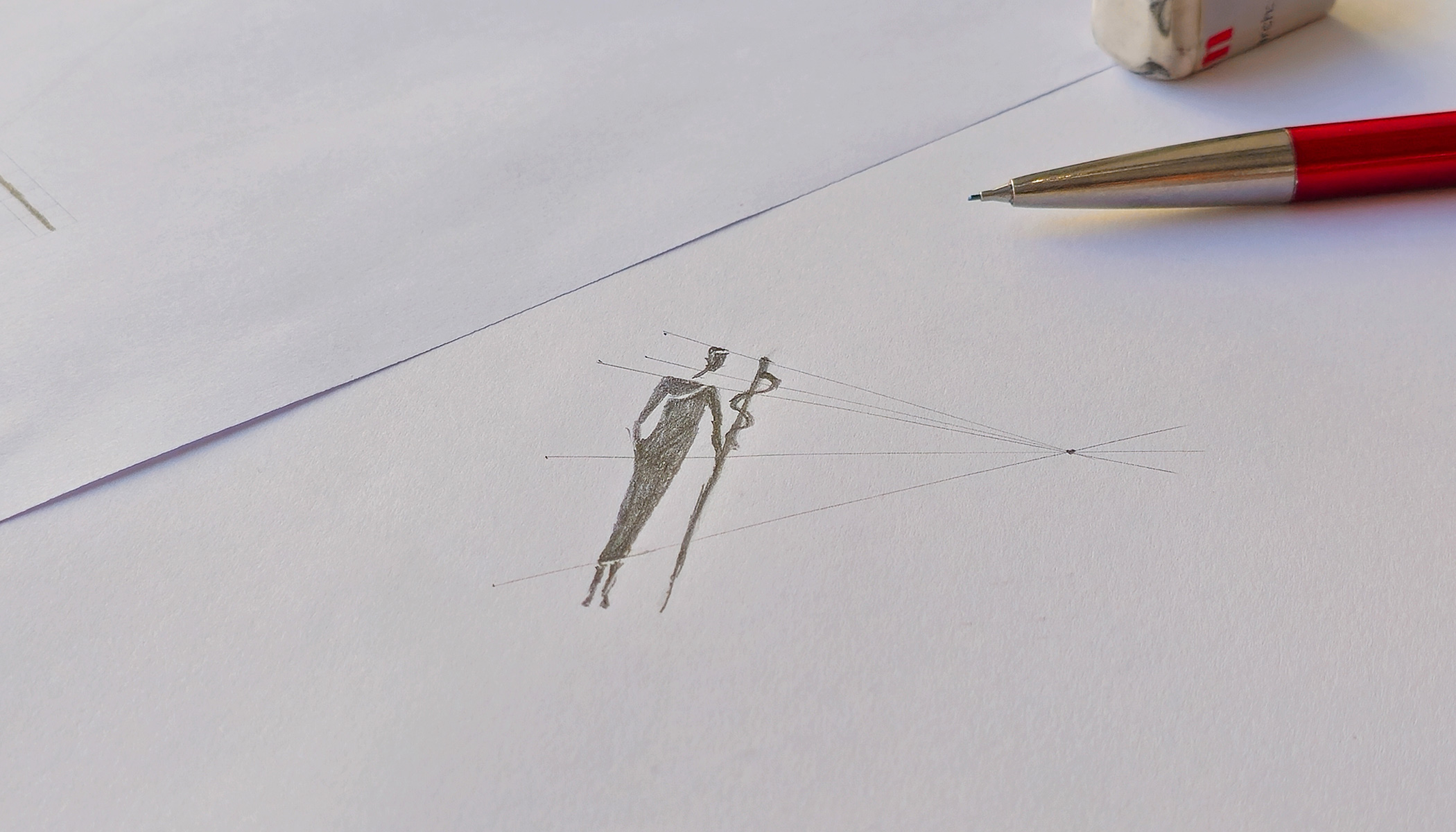
Here is a sketch from the early stages of the design process, showcasing the initial concept that evolved into the final logo.

A sketch from the last stages of the design process.

Visual Showcase

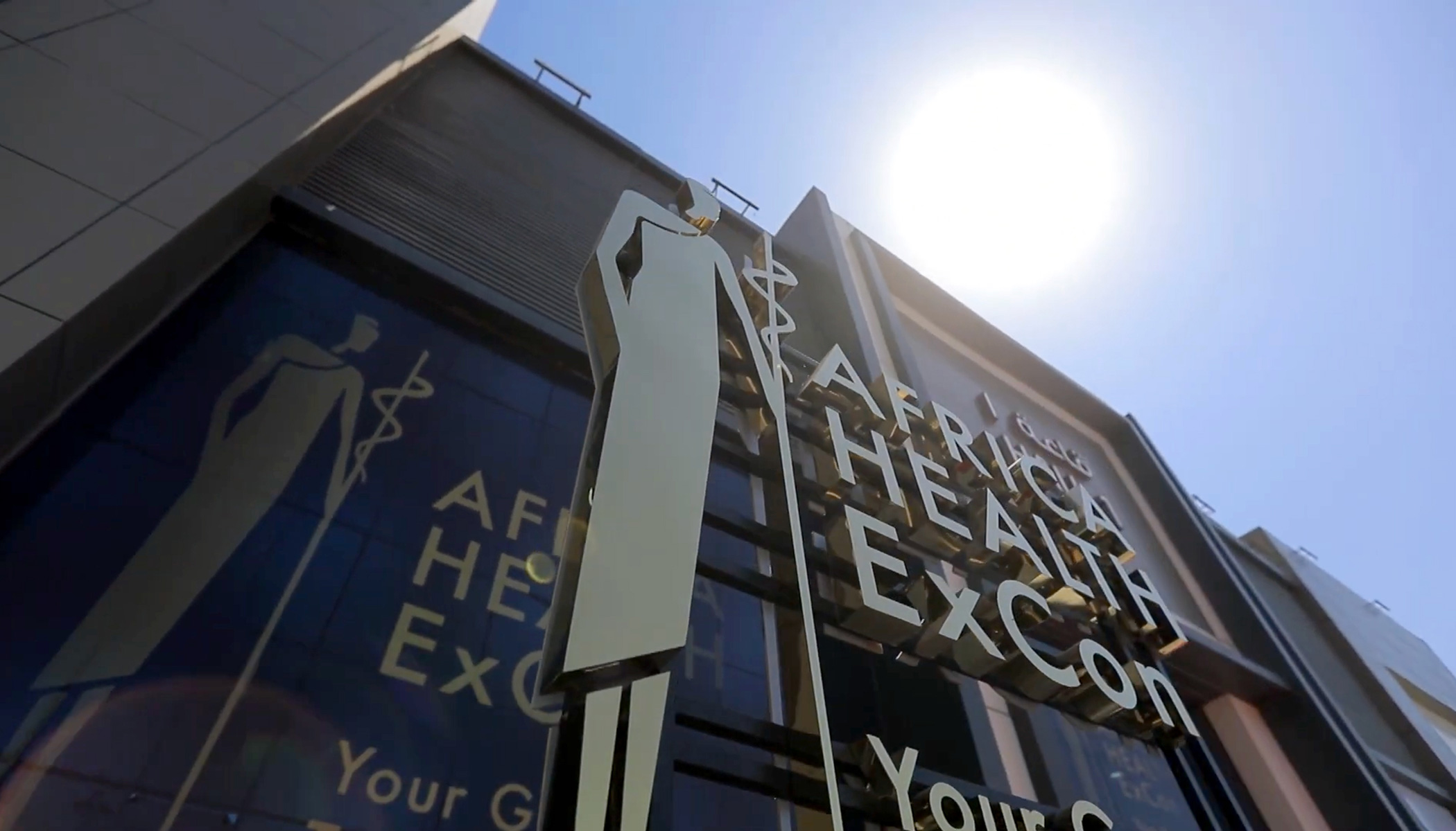
Explore the video below to see the logo in various applications and contexts, highlighting its versatility and impact.

Branding, Logo Design, Web Design e Fotografia per Agriturismo La Torre di San Martino di Panzano in Chianti

I am pleased to have collaborated with Agriturismo La Torre di San Martino di Panzano, located in the heart of one of the most beautiful landscapes in the world (the Tuscan landscape, with its rolling hills, vineyards, and olive groves): Tuscany.

Branding / Web Design / Photography

This collaboration has allowed us to best enhance Agriturismo La Torre di San Martino di Panzano, creating a coherent and captivating image that attracts and inspires visitors, offering them a taste of the beauty and tranquility of Tuscany.

(more…)

Introducing “La Femmina”: A Celebration of Empowerment and Elegance

Crafted for the US market in collaboration with the Miami-based advertising agency “Man-Super” for one of Italy’s most esteemed wine brands, Zonin, “La Femmina” is more than just a beautiful bottle; it embodies quality and excellence in winemaking.

The design of “La Femmina” is a study in minimalism and symbolic power. The label is dominated by the elegant and commanding presence of the female symbol, celebrating the essence of femininity and its vital role. This striking visual is intended to honor the strength, grace, and influence of women, making it a standout piece on any wine lover’s shelf.

On the capsule, the male symbol is oriented towards the female symbol, representing harmony and mutual respect between genders. This detail adds a unique and thoughtful twist to the design.

Experience the elegance and strength of “La Femmina” with each sip. Cheers to empowerment and sophistication!

“Dream Hunter”: A Tribute to Modern Artistry

“Dream Hunter” is dedicated to a contemporary artist and their masterpiece, the Dream Hunter statue. This label is designed for a young, modern wine that captures the spirit of creativity and the pursuit of dreams.

As a Pinot Grigio, “Dream Hunter” embodies the vibrant and refreshing qualities of this varietal. Its crisp acidity and light, fruity notes make it the perfect companion for those who chase their dreams and embrace modern elegance.

Raise a glass to inspiration and creativity!