Olive Oil Labels for Krk, Croatia
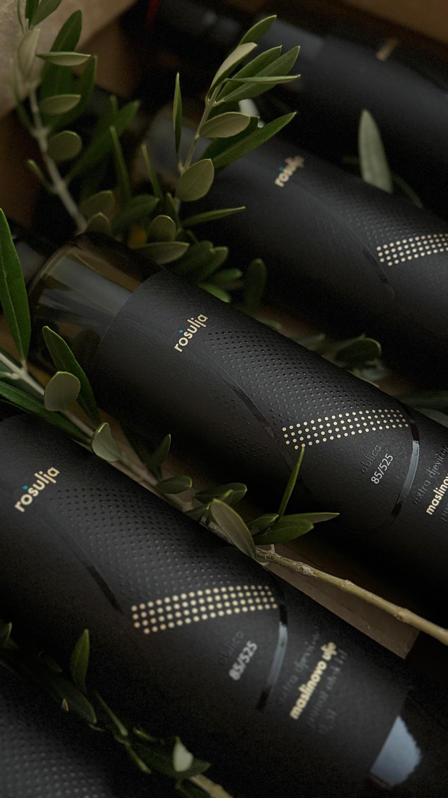
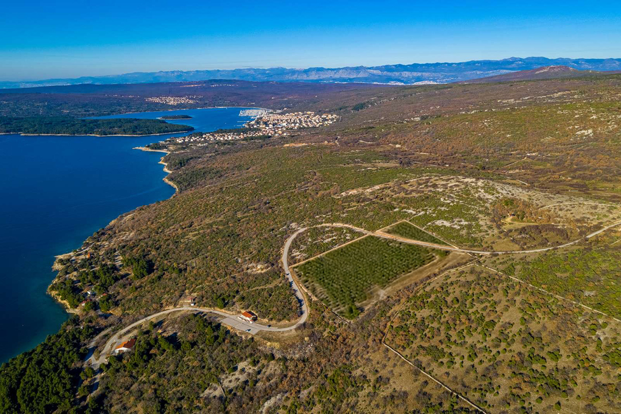
A sophisticated set of six olive oil labels, each representing a unique variety of olives from the stunning island of Krk, Croatia. The rectangular form of the olive grove and the incredible S-shaped road that cuts through the grove twice served as inspiration for this innovative design. This unique element adds a modern twist, symbolizing the seamless blend of nature and human ingenuity.
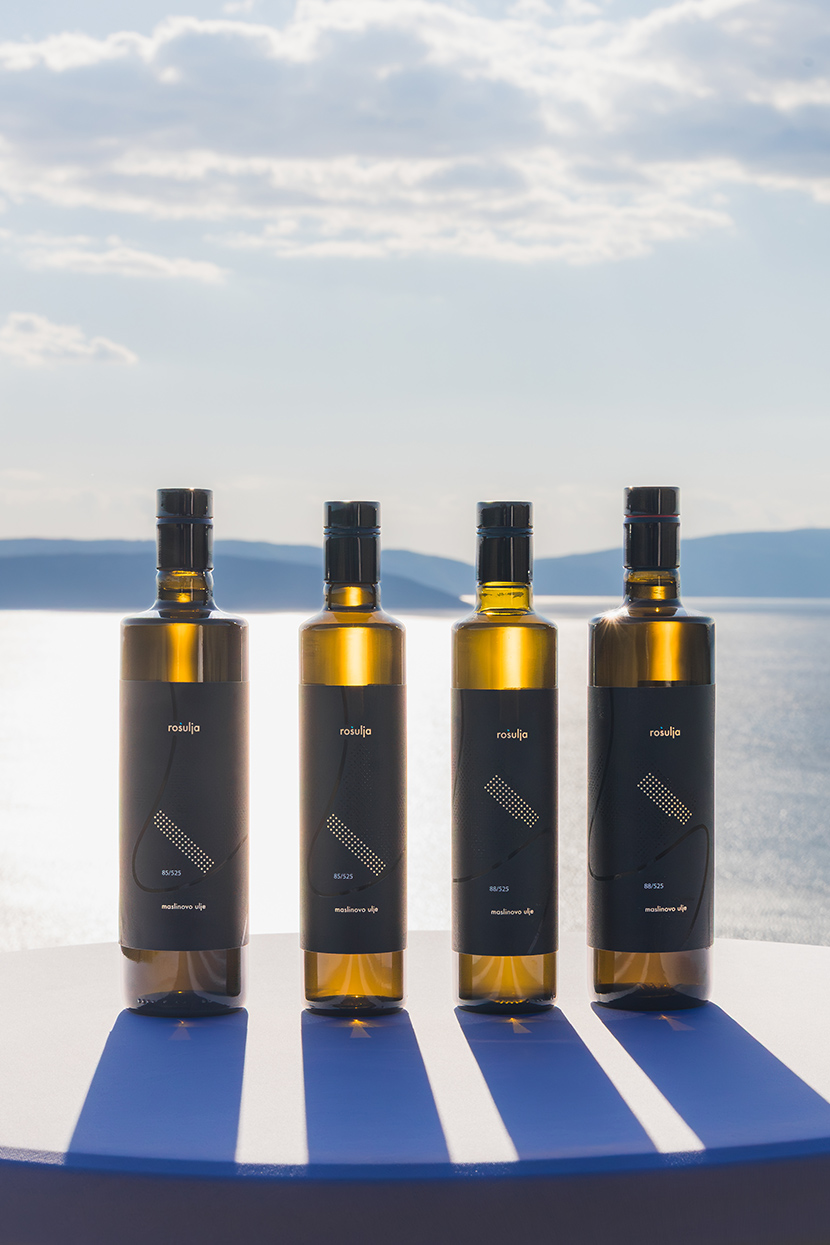
Each label features a striking black background adorned with golden circles, signifying the specific type of olives. The golden accents, created using the hot foil technique, stand out majestically, while the subtle black circles represent the other olive varieties, adding a layer of depth and intrigue. This meticulous design not only reflects the premium quality of the olive oil but also pays homage to the rich heritage of Krk’s olive groves.
Experience the fusion of traditional craftsmanship and modern design with these exquisite labels, embodying the essence of one of the world’s most beautiful islands.
Award-Winning Olive Oil Packaging Design
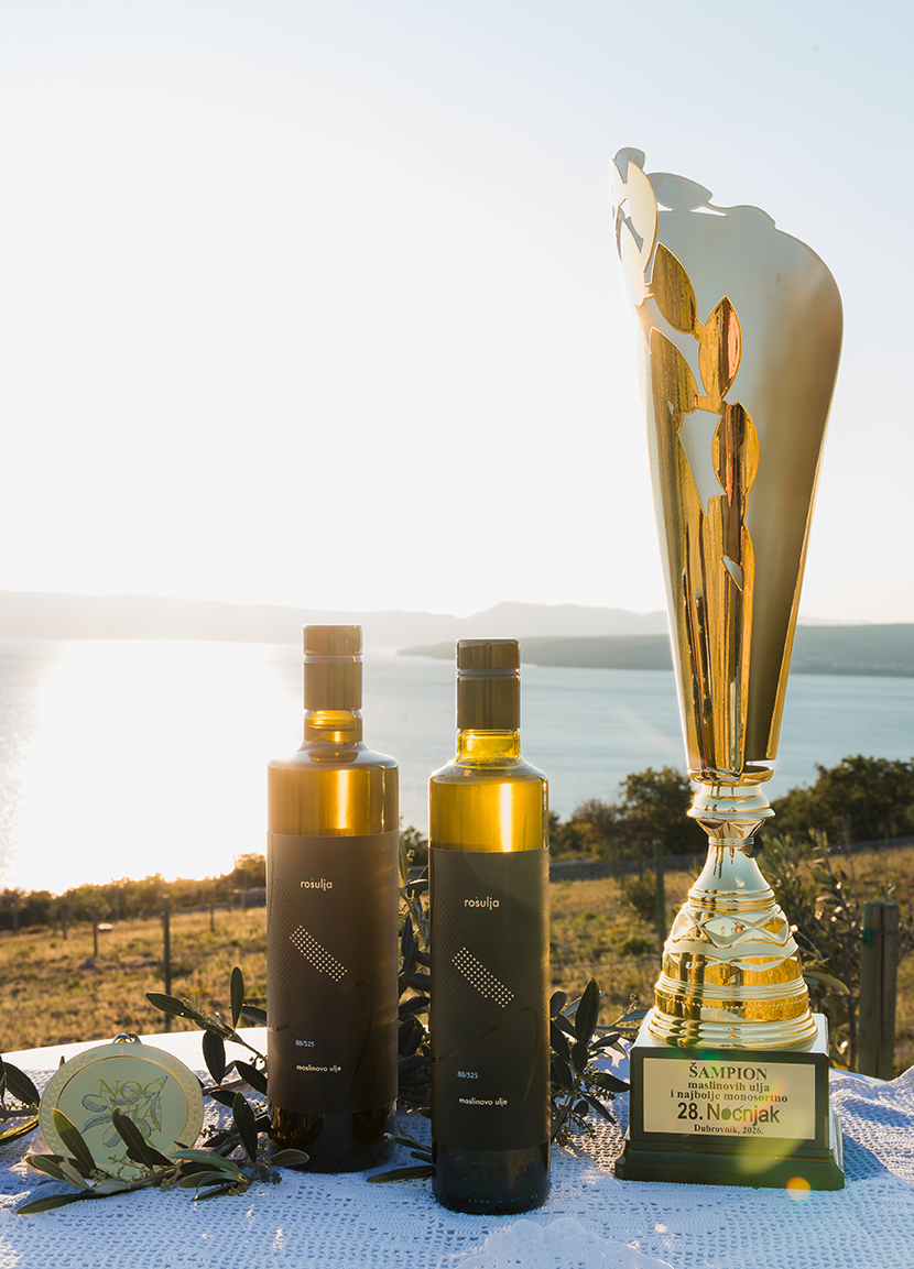
Proud to share that this olive oil label design for Rošulja received the Gold Medal and Champion Trophy at Noćnjak 2026, Dubrovnik, Croatia, one of the most important international olive oil events in Croatia. The project was awarded in the categories of Champion for Packaging Quality and Best Monovarietal Extra Virgin Olive Oil, recognizing both the excellence of the product and the quality of its presentation.
This recognition celebrates not only the outstanding quality of the extra virgin olive oil, but also the role of packaging design in communicating authenticity, heritage, and premium value.