
Corte di Leo Brand Identity, Naming and Packaging System
A celestial brand system mapped from a Tuscan vineyard
Corte di Leo is a complete brand identity, naming and packaging system developed from the resemblance between a Tuscan vineyard and the Leo constellation.
Read the full story
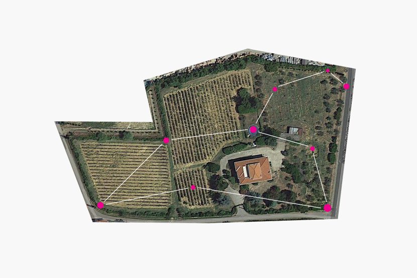
The project began with an unusual observation: seen from above, the actual shape of the vineyard recalls the constellation of Leo. Rather than treating this resemblance as a decorative reference, it became the strategic foundation for the brand name, its visual identity and a family of distinct product names.
The result is a coherent celestial universe in which every wine has its own character, while remaining recognisably part of Corte di Leo.
A brand written in the landscape
The name Corte di Leo was created from the relationship between the estate and the geometry of its land. The vineyard provided something more valuable than an invented symbol: a genuine point of origin that could structure the entire identity.
The Leo constellation became the basis of the brand mark, while its stars, astronomical names and symbolic associations created a flexible language for naming and differentiating the products.
This transformed a geographical feature into a system capable of supporting the estate as it evolved—from its first wine to rosé, reserve wine, olive oil and digital communication.
One constellation, a family of distinct products
The naming architecture was designed to give every product an individual voice without separating it from the master brand.
Primo di Leo represents the estate’s beginning. Leonessa introduces a more feminine and sensorial expression. Rosso di Leo Riserva explores time, material and ageing. Olio di Leo demonstrates how the same identity can extend naturally beyond wine.
The products do not rely on identical labels. Their connection comes from a shared origin, a consistent visual language and different interpretations of the same constellation.
Leonessa — quiet power revealed through the wine
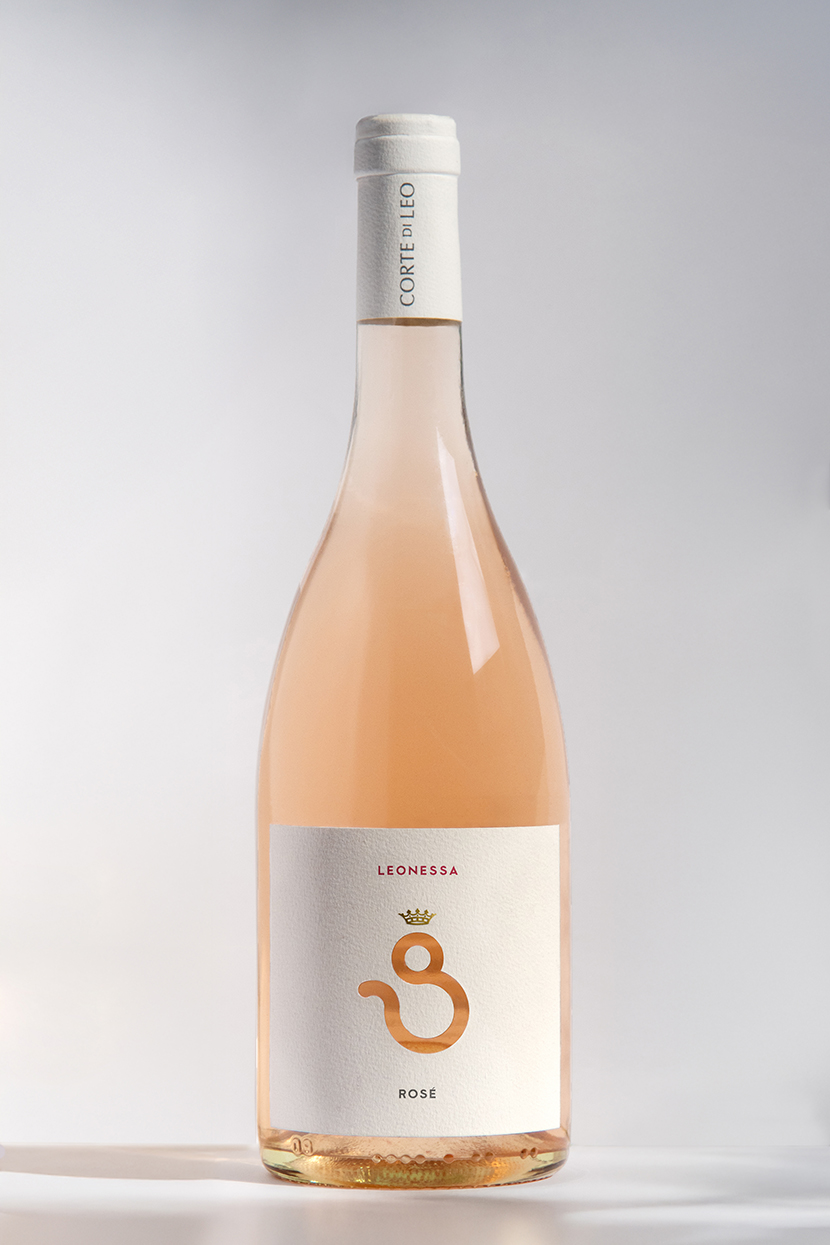
Leonessa developed the Leo symbolism in a more fluid and feminine direction.
Read the full story
The astrological sign was rotated and reinterpreted to form the figure of a lioness. Its circular element became the head, completed by a small crown, while the descending curve suggested the movement of a tail.
The symbol was die-cut from the label, allowing the natural colour of the rosé to appear through the opening. The wine therefore becomes part of the identity itself: as its colour changes with light and context, the lioness subtly changes with it.
Rather than placing an image on the bottle, the packaging uses the product to complete the image.
Primo di Leo — the first light

Primo di Leo was the first wine released by the estate. Its name—literally “the first of Leo”—marks both the beginning of the product range and the first expression of the Corte di Leo identity.
Read the full story
The concept also refers to Regulus, the brightest star in the Leo constellation. Traditionally known as the “Little King”, Regulus provided a precise symbolic reference for a wine introducing a new estate.
A restrained black label evokes the night sky, while the blue-white star and constellation symbol identify the wine through a minimal composition. Instead of illustrating Tuscany conventionally, the design communicates origin through the specific celestial geometry found in the vineyard.
Rosso di Leo Riserva — a label that ages with the wine


For Rosso di Leo Riserva, the identity moved from astronomical symbolism to material transformation.
Read the full story
Real drops of wine were applied to a premium cotton paper with a visible cross-fibre structure. Because the liquid interacts differently with each sheet, no two labels are exactly alike.
A natural antioxidant derived from Italian lemons was used to slow the oxidation of the wine marks. Their colour can therefore evolve gradually over time, creating a surface that records ageing instead of merely describing it.
The reserve label does not simply communicate the passage of time; it participates in it.
This approach gives the limited edition a physical individuality appropriate to the product. Each bottle carries a unique trace of the wine it contains.
Olio di Leo — extending the identity beyond wine
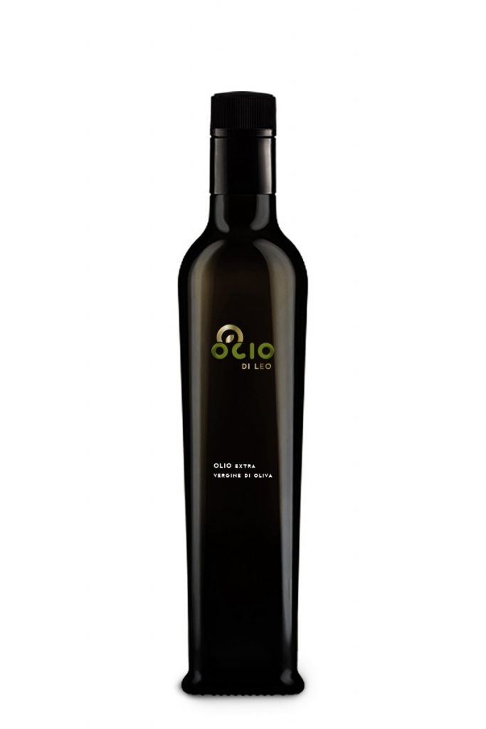
The system was also applied to Olio di Leo, the estate’s olive oil.
Read the full story
Its name and visual language connect it immediately to Corte di Leo without making it appear to be another wine. The constellation provides continuity, while the packaging adapts the system to a different product category.
This extension demonstrates that the identity was conceived as a long-term brand platform rather than as a collection of unrelated labels.
From packaging to digital experience
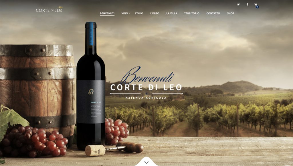
The original project also extended into website design, photography and the digital presentation of the estate.
Read the full story
The aim was to translate the same restrained celestial atmosphere into a digital environment: clear information, strong product imagery and a visual rhythm consistent with the packaging.
This allowed Corte di Leo to communicate as one brand across naming, bottles, printed materials and its original online presence.
A system capable of growing
Corte di Leo shows how an identity can emerge from something already present but previously unseen.
A distinctive feature of the land became a name. The name became a constellation of products. Each product received its own narrative, material expression and visual character, while the complete range remained connected to one authentic source.
The result is not simply a series of wine labels, but an expandable brand system written in the landscape.
Role and scope
Brand strategy and positioning
Master brand naming
Product naming and brand architecture
Visual identity
Wine and olive oil packaging
Concept development
Art direction and photography
Original website design and digital direction
Print and production coordination