Vino

Tenuta Baiamonte packaging system for Pietra di Mamma, Mamma Tempesta and Mamma Ombra

Tenuta Baiamonte Brand Identity and Wine Packaging

A volcanic identity for three wines from Etna

Tenuta Baiamonte is a boutique winery on the north slope of Mount Etna in Sicily, at 959 metres above sea level. The commission was to create the identity and packaging for an emerging estate and its initial three-wine range: Grecanico, Nerello Mascalese and Grenache.

Read the full story

The challenge was not simply to make another volcanic label. It was to give a small premium producer one recognisable voice, while allowing each wine to express a different character.

From research to a coherent brand system

The work began with the estate brief, competitor review, varietal research and brand positioning. The intended character was authentic, elegant, premium, timeless and distinctive, with a contemporary expression of Etna rather than a literal illustration of the volcano.

duskodesign developed the strategic direction, brand mark, wine names and the complete packaging system.

Etna as mother, not as postcard

The central idea was Mamma Etna, understood as a maternal presence that can nurture and renew, but also cast shadow and release great force. This tension created a more distinctive territory than the familiar postcard image of a volcano.

The three final names became different expressions of the same source: Pietra di Mamma, Mamma Tempesta and Mamma Ombra. Volcanic stone imagery gives each wine a geological portrait, while the names introduce emotion and character.

A mark oriented to the north

The Baiamonte mark combines a reduced profile of Etna, a north marker and a crown-like crest. It connects the estate’s position on the north slope with the sense of distinction required for a boutique winery.

Restrained typography keeps the system contemporary and allows the stone imagery to remain central across labels, capsules and corporate applications.

Tenuta Baiamonte logo printed on textured paper

One family, three characters

All three labels share the same white field, typography, layout and Baiamonte signature. The stone changes with the wine, creating individual characters within one recognisable family.

Pietra di Mamma

For the Grecanico, Pietra di Mamma uses an ochre-covered volcanic stone. Its warm mineral surface gives the white wine a tactile identity while retaining the lightest presence in the range.

Pietra di Mamma Grecanico bottle with ochre volcanic stone label
Pietra di Mamma label detail with ochre volcanic stone

Mamma Tempesta

Created for the Nerello Mascalese, Mamma Tempesta uses an irregular fragment of dark lava. Small details selected in gold bring light and value to the raw geological surface, making this the most forceful expression in the family.

Mamma Tempesta Nerello Mascalese bottle with dark lava label
Mamma Tempesta label detail with gold accents on dark lava

Mamma Ombra

For the Grenache, Mamma Ombra is represented by a smooth black stone crossed by a fine gold incision. Its reduced form creates the quietest and most enigmatic character of the three wines.
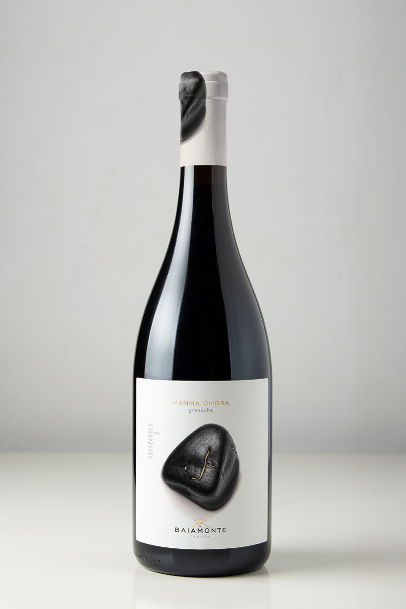
Mamma Ombra Grenache bottle with smooth black volcanic stone label

Material detail without excess

The production system was specified around white label stocks, black and grey inks, a controlled red accent and Kurz 429 gold foil. The capsule designs continue the volcanic imagery beyond the front label, giving the bottles a coherent presence from closure to base.

Tenuta Baiamonte logo, colour palette and production specifications

From concept to print

duskodesign developed the research, positioning, wine naming, brand identity and complete packaging system. The production scope included front and back labels for three wines, capsule design, colour and foil specifications, print-ready artwork and technical preparation for printing.

The result is one coherent identity with three individual characters, all connected to the same estate and the same mountain.
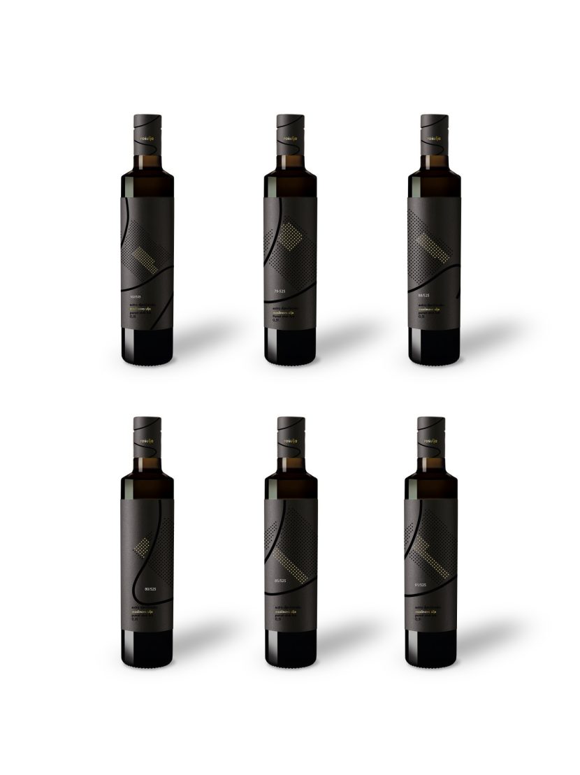
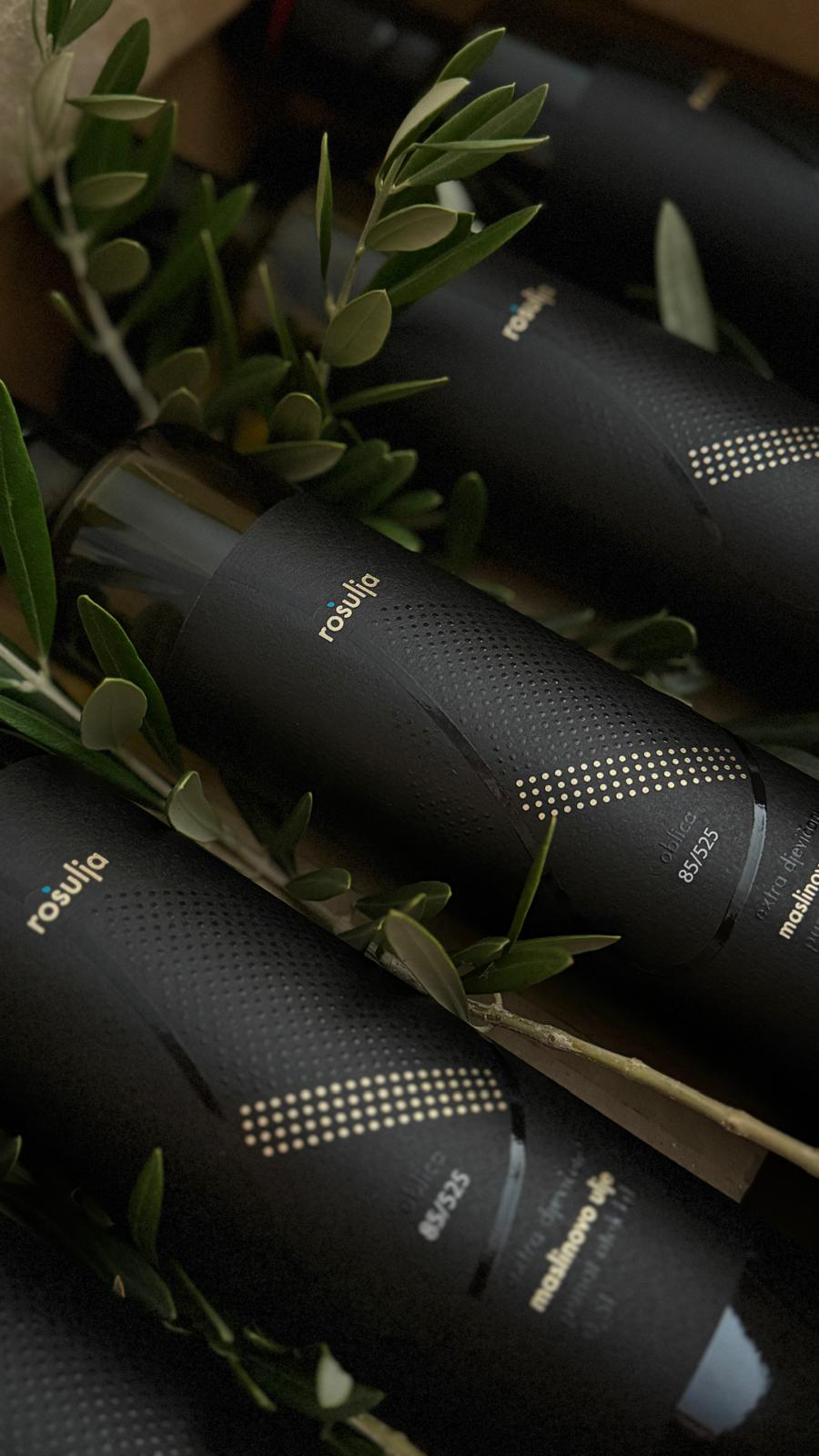
Six Rošulja olive oil bottles with individual grove-mapped labels

Rošulja Olive Oil Brand and Packaging Design

An identity mapped from the grove itself

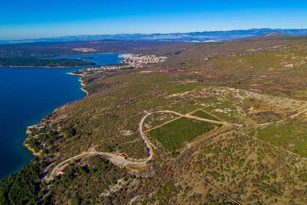
Rošulja is a brand and packaging system created for a family olive grove on the island of Krk, Croatia.

Originally commissioned as a set of olive oil labels, the project grew through research and conversations with the client into a complete identity for an authentic island product. The aim was to create packaging that felt local without becoming folkloric, premium without becoming generic, and valuable enough to be taken home as a gift.

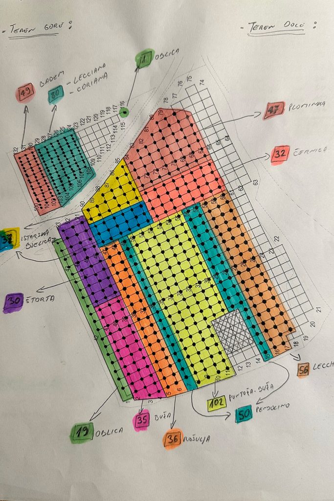
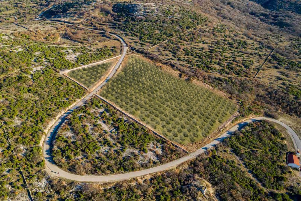
Rošulja olive grove tree distribution translated into olive oil label design

Every label is a precise map of origin

The actual outline of the grove and the S-shaped road that crosses it became the structure of the identity. Instead of using a generic symbol of olive oil, the packaging is built from the precise geography of Rošulja.

Read the full story

Every circle represents a real olive tree. Gold circles mark the actual position of the trees belonging to the variety inside that bottle, while the remaining trees stay black. References such as 102/525 state the number of trees of that cultivar in relation to the total number in the grove.

This turns every label into a precise map of origin.

Rošulja olive oil bottles with black and gold foil labels

One grove, six individual oils

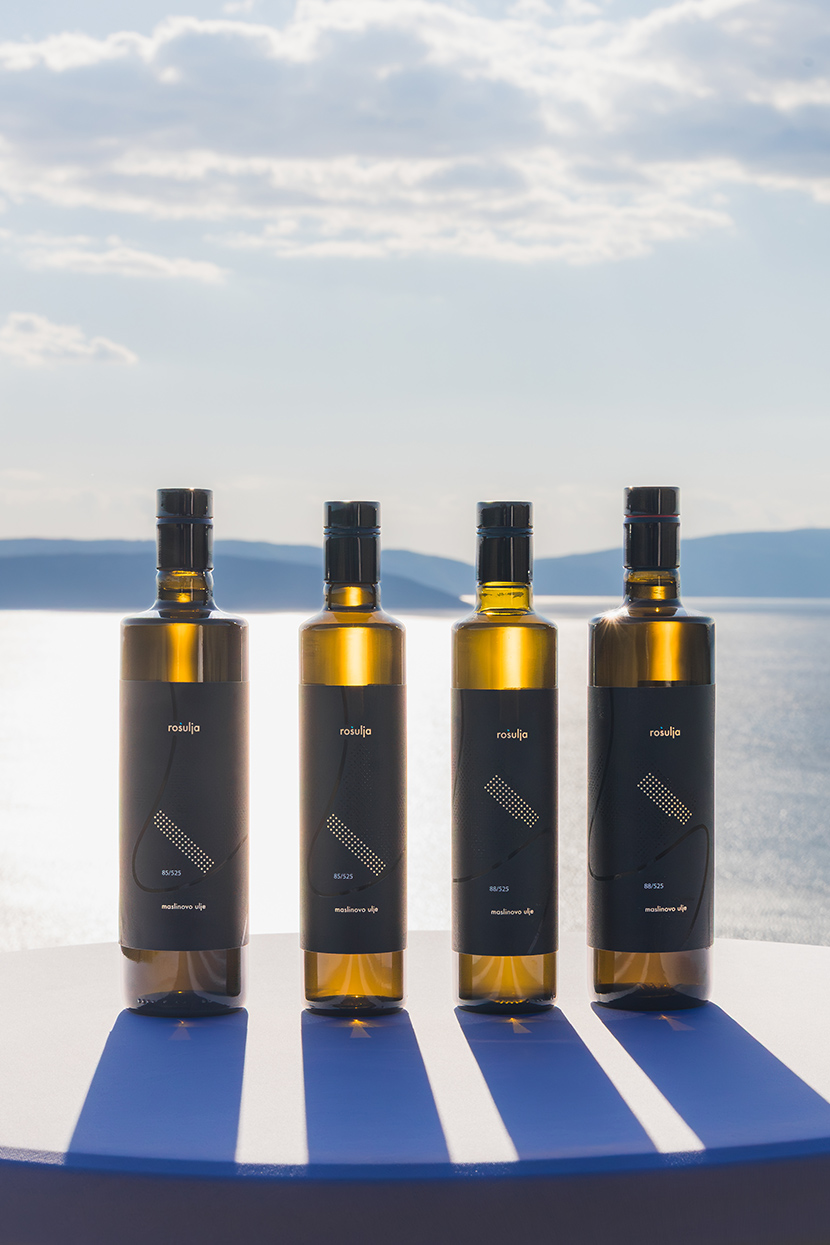
The client had planned several olive varieties, but the idea of giving each variety its own label was developed as part of the design strategy. All six labels share the same structure, typography and grove outline, while the gold pattern changes according to the actual distribution of each cultivar.

Read the full story

Together they form one coherent family. Individually, each bottle carries its own map. A restrained black base moves the product away from conventional rustic packaging, while gold foil and transparent varnish give the surface depth and material value.

Four Rošulja olive oil bottles with individual varietal label designs

From strategy to production

duskodesign developed the research, positioning, creative direction, brand identity and complete packaging system. The work included the selection of paper, gold foil and transparent varnish, print-ready artwork, and direct production coordination with the Croatian printer recommended by the client.

Read the full story

The bottle had already been selected by the client. Everything else, from the visual strategy and six-label system to the final production files, was developed and managed by duskodesign.

Independent recognition

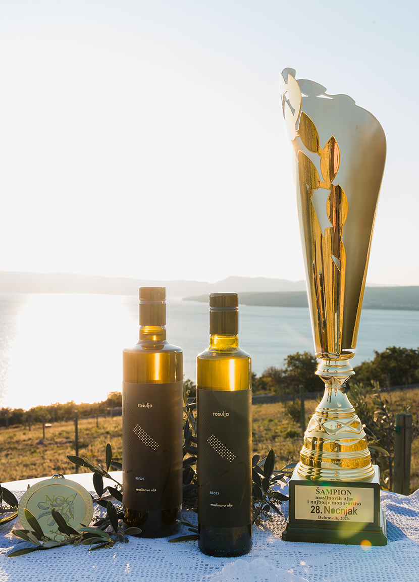
At Noćnjak 2026, OPG Rošulja, Roko Šulina, received the title Champion for packaging quality and best monovarietal extra virgin olive oil for its Oblica oil.

Read the full story

The recognition connected the quality of the product with the quality of its presentation, confirming the central idea of the project: an authentic island oil expressed through a packaging system grounded in its real place of origin.

Rošulja olive oil bottles with the Noćnjak 2026 Champion trophy
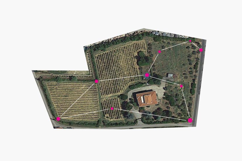
Leo constellation concept derived from the shape of a Tuscan vineyard

Corte di Leo Brand Identity, Naming and Packaging System

A celestial brand system mapped from a Tuscan vineyard

Corte di Leo is a complete brand identity, naming and packaging system developed from the resemblance between a Tuscan vineyard and the Leo constellation.

Read the full story

The project began with an unusual observation: seen from above, the actual shape of the vineyard recalls the constellation of Leo. Rather than treating this resemblance as a decorative reference, it became the strategic foundation for the brand name, its visual identity and a family of distinct product names.

The result is a coherent celestial universe in which every wine has its own character, while remaining recognisably part of Corte di Leo.

A brand written in the landscape

The name Corte di Leo was created from the relationship between the estate and the geometry of its land. The vineyard provided something more valuable than an invented symbol: a genuine point of origin that could structure the entire identity.

The Leo constellation became the basis of the brand mark, while its stars, astronomical names and symbolic associations created a flexible language for naming and differentiating the products.

This transformed a geographical feature into a system capable of supporting the estate as it evolved—from its first wine to rosé, reserve wine, olive oil and digital communication.

One constellation, a family of distinct products

The naming architecture was designed to give every product an individual voice without separating it from the master brand.

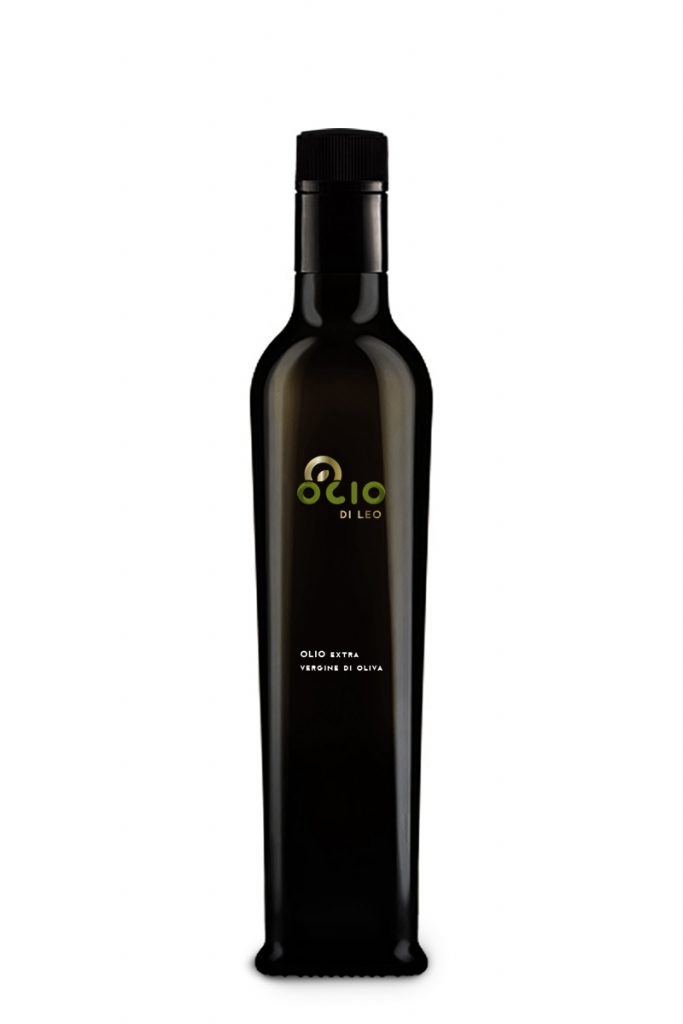
Primo di Leo represents the estate’s beginning. Leonessa introduces a more feminine and sensorial expression. Rosso di Leo Riserva explores time, material and ageing. Olio di Leo demonstrates how the same identity can extend naturally beyond wine.

The products do not rely on identical labels. Their connection comes from a shared origin, a consistent visual language and different interpretations of the same constellation.

Leonessa — quiet power revealed through the wine

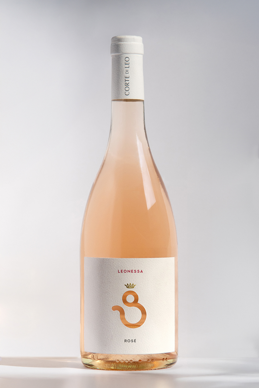
Leonessa rosé label with a die-cut lioness symbol revealing the wine colour

Leonessa developed the Leo symbolism in a more fluid and feminine direction.

Read the full story

The astrological sign was rotated and reinterpreted to form the figure of a lioness. Its circular element became the head, completed by a small crown, while the descending curve suggested the movement of a tail.

The symbol was die-cut from the label, allowing the natural colour of the rosé to appear through the opening. The wine therefore becomes part of the identity itself: as its colour changes with light and context, the lioness subtly changes with it.

Rather than placing an image on the bottle, the packaging uses the product to complete the image.

Primo di Leo — the first light

Primo di Leo wine packaging inspired by Regulus and the Leo constellation

Primo di Leo was the first wine released by the estate. Its name—literally “the first of Leo”—marks both the beginning of the product range and the first expression of the Corte di Leo identity.

Read the full story

The concept also refers to Regulus, the brightest star in the Leo constellation. Traditionally known as the “Little King”, Regulus provided a precise symbolic reference for a wine introducing a new estate.

A restrained black label evokes the night sky, while the blue-white star and constellation symbol identify the wine through a minimal composition. Instead of illustrating Tuscany conventionally, the design communicates origin through the specific celestial geometry found in the vineyard.

Rosso di Leo Riserva — a label that ages with the wine

Rosso di Leo Riserva label made with real drops of wine
Detail of wine drops applied to cotton paper for Rosso di Leo Riserva

For Rosso di Leo Riserva, the identity moved from astronomical symbolism to material transformation.

Read the full story

Real drops of wine were applied to a premium cotton paper with a visible cross-fibre structure. Because the liquid interacts differently with each sheet, no two labels are exactly alike.

A natural antioxidant derived from Italian lemons was used to slow the oxidation of the wine marks. Their colour can therefore evolve gradually over time, creating a surface that records ageing instead of merely describing it.

The reserve label does not simply communicate the passage of time; it participates in it.

This approach gives the limited edition a physical individuality appropriate to the product. Each bottle carries a unique trace of the wine it contains.

Olio di Leo — extending the identity beyond wine

Olio di Leo olive oil packaging extending the Corte di Leo identity

The system was also applied to Olio di Leo, the estate’s olive oil.

Read the full story

Its name and visual language connect it immediately to Corte di Leo without making it appear to be another wine. The constellation provides continuity, while the packaging adapts the system to a different product category.

This extension demonstrates that the identity was conceived as a long-term brand platform rather than as a collection of unrelated labels.

From packaging to digital experience

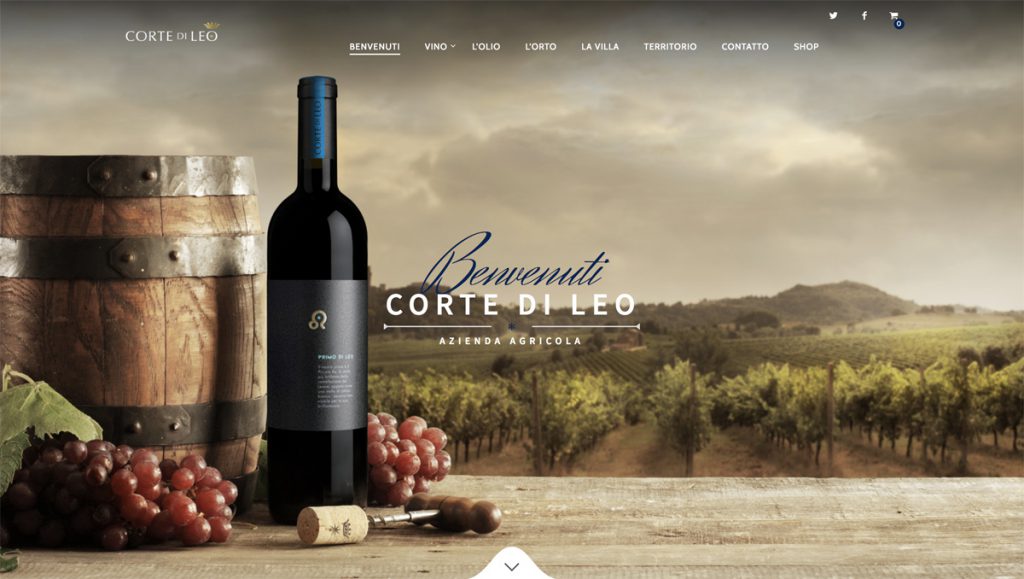
Original Corte di Leo website and digital brand presentation

The original project also extended into website design, photography and the digital presentation of the estate.

Read the full story

The aim was to translate the same restrained celestial atmosphere into a digital environment: clear information, strong product imagery and a visual rhythm consistent with the packaging.

This allowed Corte di Leo to communicate as one brand across naming, bottles, printed materials and its original online presence.

A system capable of growing

Corte di Leo shows how an identity can emerge from something already present but previously unseen.

A distinctive feature of the land became a name. The name became a constellation of products. Each product received its own narrative, material expression and visual character, while the complete range remained connected to one authentic source.

The result is not simply a series of wine labels, but an expandable brand system written in the landscape.

Role and scope

Brand strategy and positioning
Master brand naming
Product naming and brand architecture
Visual identity
Wine and olive oil packaging
Concept development
Art direction and photography
Original website design and digital direction
Print and production coordination

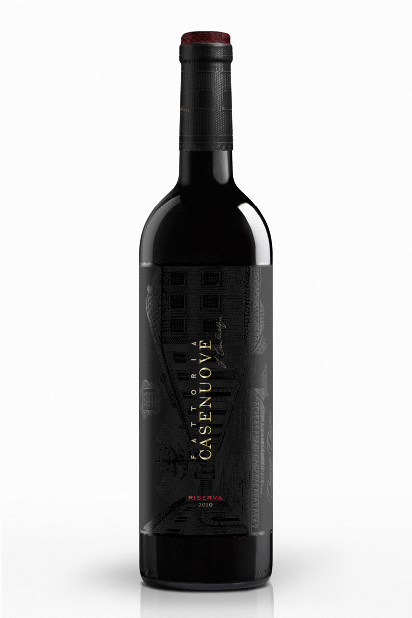
Fattoria Casenuove Riserva black wine label with tonal estate illustration and gold typography

Fattoria Casenuove Wine Label and Packaging Design

The work for Fattoria Casenuove explores how a Tuscan winery can preserve the authority of Chianti tradition while giving each wine its own distinct voice. Across Riserva, Chianti Classico and Il Codibugnolo, inherited imagery is edited, repositioned or reduced according to the character of the wine rather than repeated as decoration.

Riserva — tradition revealed through light

Riserva represents the estate’s most serious and prestigious expression of Sangiovese. Instead of displaying the historical imagery openly, the design embeds it as a subtle tonal layer across the near-black label. The architecture of the estate becomes visible only as light moves across the bottle.

Gold typography establishes the hierarchy, while a restrained red accent identifies the Riserva. The result preserves a connection with the winery’s history while giving the wine a darker, more contemporary presence.

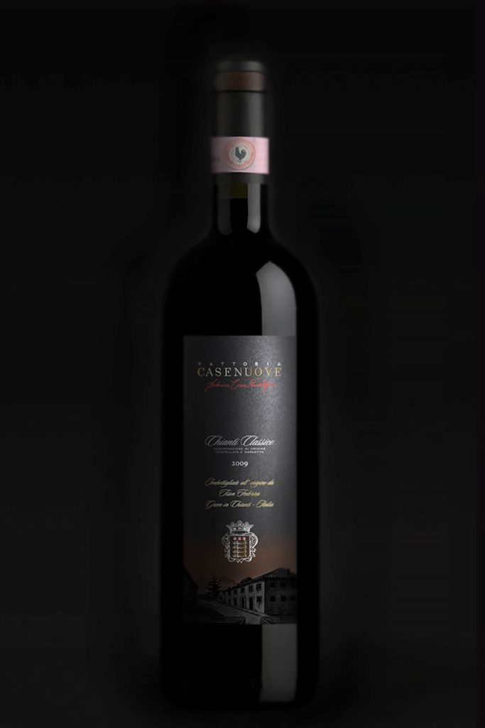
Chianti Classico — heritage given new weight

For the Chianti Classico, recognisable elements from the historical label—including the estate and its coat of arms—were retained but reorganised within a stronger and more substantial composition.

The redesign preserves continuity with the winery’s past while improving hierarchy, clarity and shelf presence. Tradition remains visible, but it is treated as an active part of the new identity rather than as nostalgic decoration.

Fattoria Casenuove Chianti Classico bottle with redesigned black label and historic estate illustration

Il Codibugnolo — a lighter expression of the estate

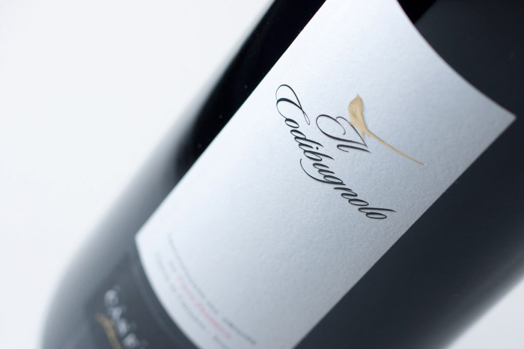
Il Codibugnolo is the lightest and most playful wine in the range. The starting point was the owner’s wish to feature the long-tailed tit from which the wine takes its name. The challenge was to prevent a complex bird illustration from making the label feel overly decorative or heavy.

The final design reduces the bird to a delicate golden gesture and combines it with fluid calligraphic lettering and generous white space. The result gives the wine an individual, approachable character while remaining connected to the quality of the estate.

Il Codibugnolo wine label detail with gold long-tailed tit illustration and calligraphic lettering
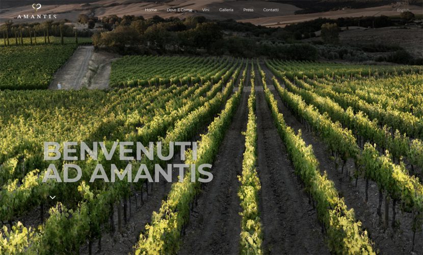
Amantis winery website homepage featuring original vineyard photography

Amantis Winery Website Design and Photography

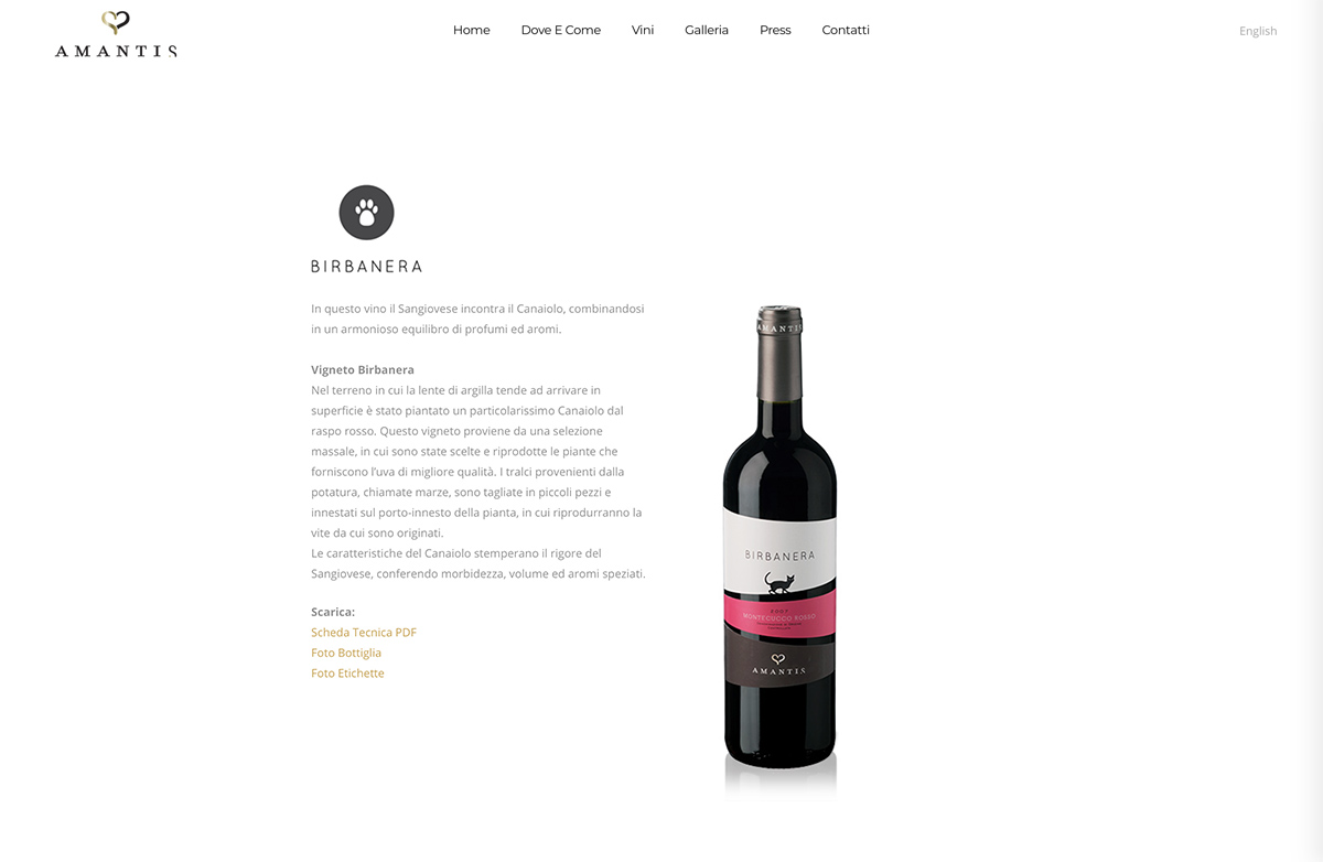
Amantis is a family-run winery shaped by a close relationship with the Tuscan landscape. duskodesign created the website and original photography, developing a clear digital presentation that connects the story of the estate, its vineyards and individual wines. Expansive landscape imagery establishes a strong sense of place, while the restrained interface gives the content and products space to communicate with clarity.

Amantis winery website wine page presenting the Birbanera bottle
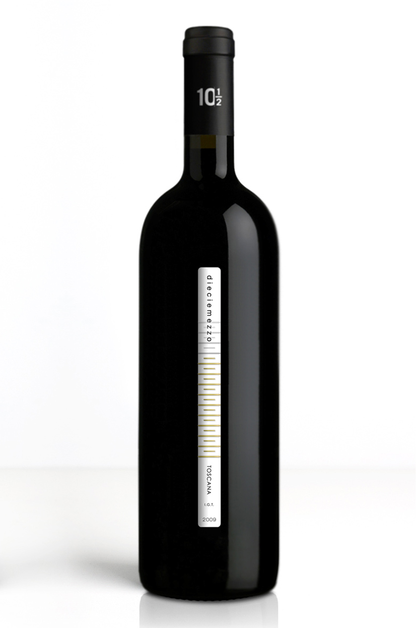
Dieci e Mezzo wine bottle with slender vertical label inspired by its 10.5 percent alcohol content

Dieci e Mezzo Wine Label Design

Dieci e Mezzo is built around a simple product fact: the wine’s 10.5% alcohol content. The numerical name turns its lower alcohol level into a distinctive identity rather than presenting it as a compromise. The idea is translated into an unusually narrow vertical label whose proportions reinforce the wine’s lightness and immediately distinguish the bottle on the shelf. A measured rhythm of fine gold lines, restrained typography and the contrast between the white label and dark glass give the design precision, elegance and a clear visual signature.

La Femmina wine bottle for Zonin with female symbol, overlapping colour and gold foil

La Femmina Wine Label Design for Zonin

Created for the US market in collaboration with the Miami-based agency Man-Super for Zonin, La Femmina is built around a direct symbolic identity. The female symbol becomes both the name and the principal visual device, constructed through overlapping colour, gold foil and the deep black surface of the bottle. Its scale and simplicity give the packaging immediate recognition while maintaining a restrained premium character. The capsule extends the concept through a complementary male symbol oriented towards the female mark, introducing a subtle secondary narrative without competing with the clarity of the front design.