Florence / Italy

etichetta

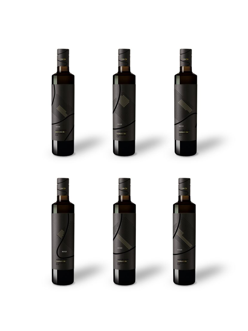
Work in Progress / Olive Oil Labels for Krk, Croatia

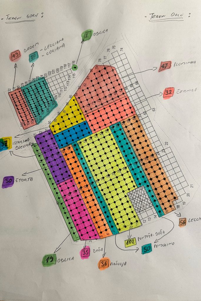
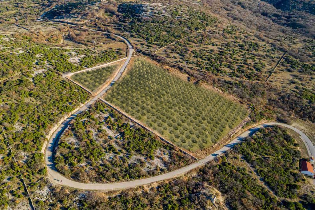
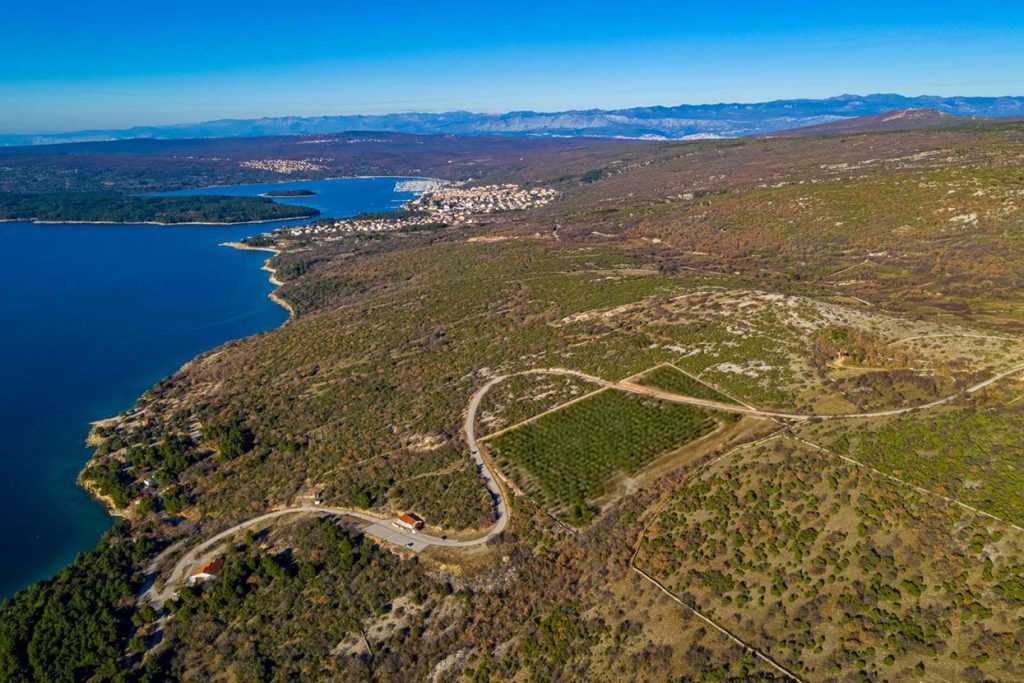
A sophisticated set of six olive oil labels, each representing a unique variety of olives from the stunning island of Krk, Croatia. The rectangular form of the olive grove and the incredible S-shaped road that cuts through the grove twice served as inspiration for this innovative design. This unique element adds a modern twist, symbolizing the seamless blend of nature and human ingenuity.

Each label features a striking black background adorned with golden circles, signifying the specific type of olives. The golden accents, created using the hot foil technique, stand out majestically, while the subtle black circles represent the other olive varieties, adding a layer of depth and intrigue. This meticulous design not only reflects the premium quality of the olive oil but also pays homage to the rich heritage of Krk’s olive groves.

Experience the fusion of traditional craftsmanship and modern design with these exquisite labels, embodying the essence of one of the world’s most beautiful islands.


Rosso di Leo

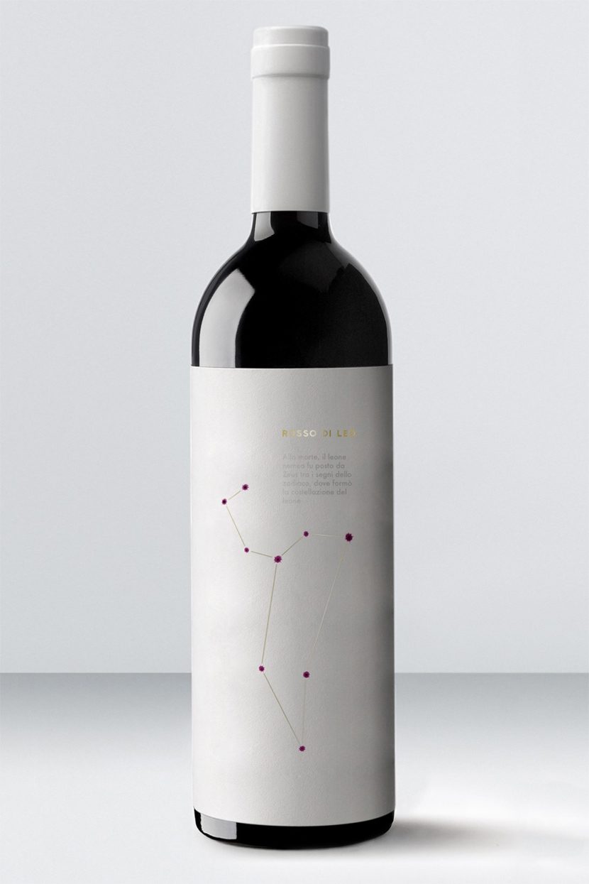
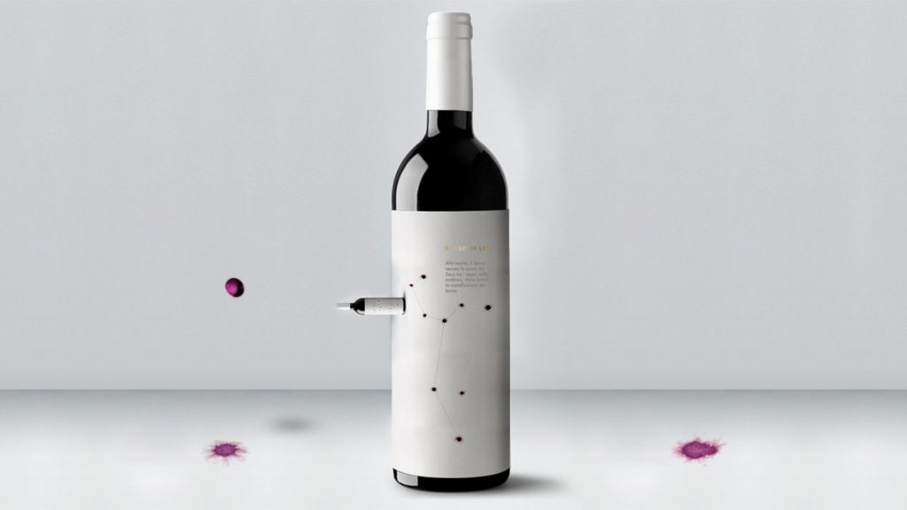
The label is designed using drops of the wine.
Unique and very special for an equally special “reserve.”
The label takes advantage of the unique, intense, and vibrant color of the wine made from the indigenous Tuscan grape “Foglia Tonda.” For the first time, thanks to a very limited production, the wine itself is applied naturally, with drops on the surface of the cotton paper. This special paper, with its cross-fiber structure, absorbs the wine spectacularly, creating a unique design effect, aided by nature itself.
Each individual label is different, crafted by hand, one at a time. In this way, all the passion, warmth, and love are conveyed in each single example of this precious liquid.
The applied wine, partially protected by a natural antioxidant derived from Italian lemons, gradually changes color over time. Thus, the age and aging of the wine can be read directly from the label.


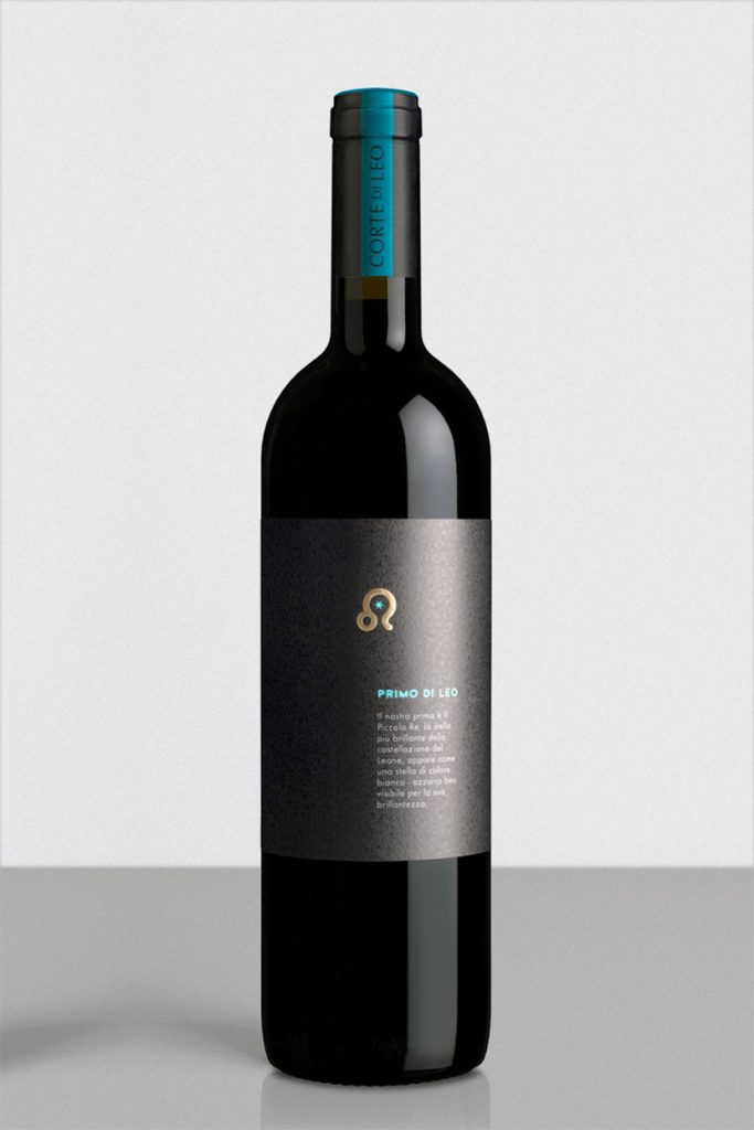
“Primo di Leo”: The Little King of Wines

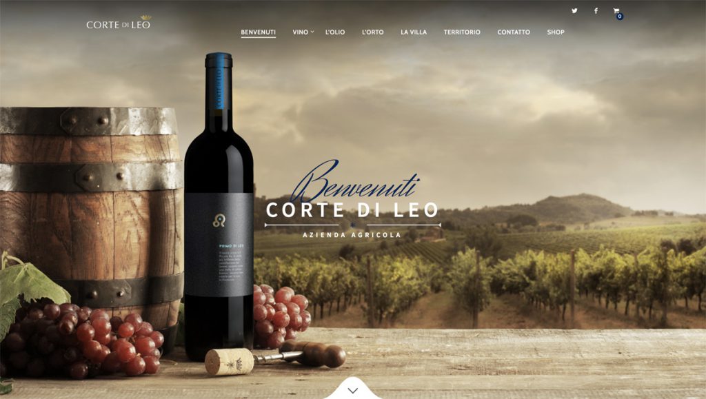
“Primo di Leo” is a concept specially developed to embody the essence of the vineyard and the brilliance of their first release. Named after the vineyard’s unique shape, which mirrors the Leo constellation, this wine symbolizes the Little King, inspired by Regulus, the constellation’s brightest star. Regulus shines as a brilliant white-blue star, standing out for its luminosity.

The wine is crafted from the beautiful “Foglia Tonda,” an ancient Italian grape known for its rich, full-bodied character and deep, vibrant flavors.

Experience the brilliance and elegance of “Primo di Leo.” Raise a glass to new beginnings and celestial inspiration!


Website & Photography

Sizzilla

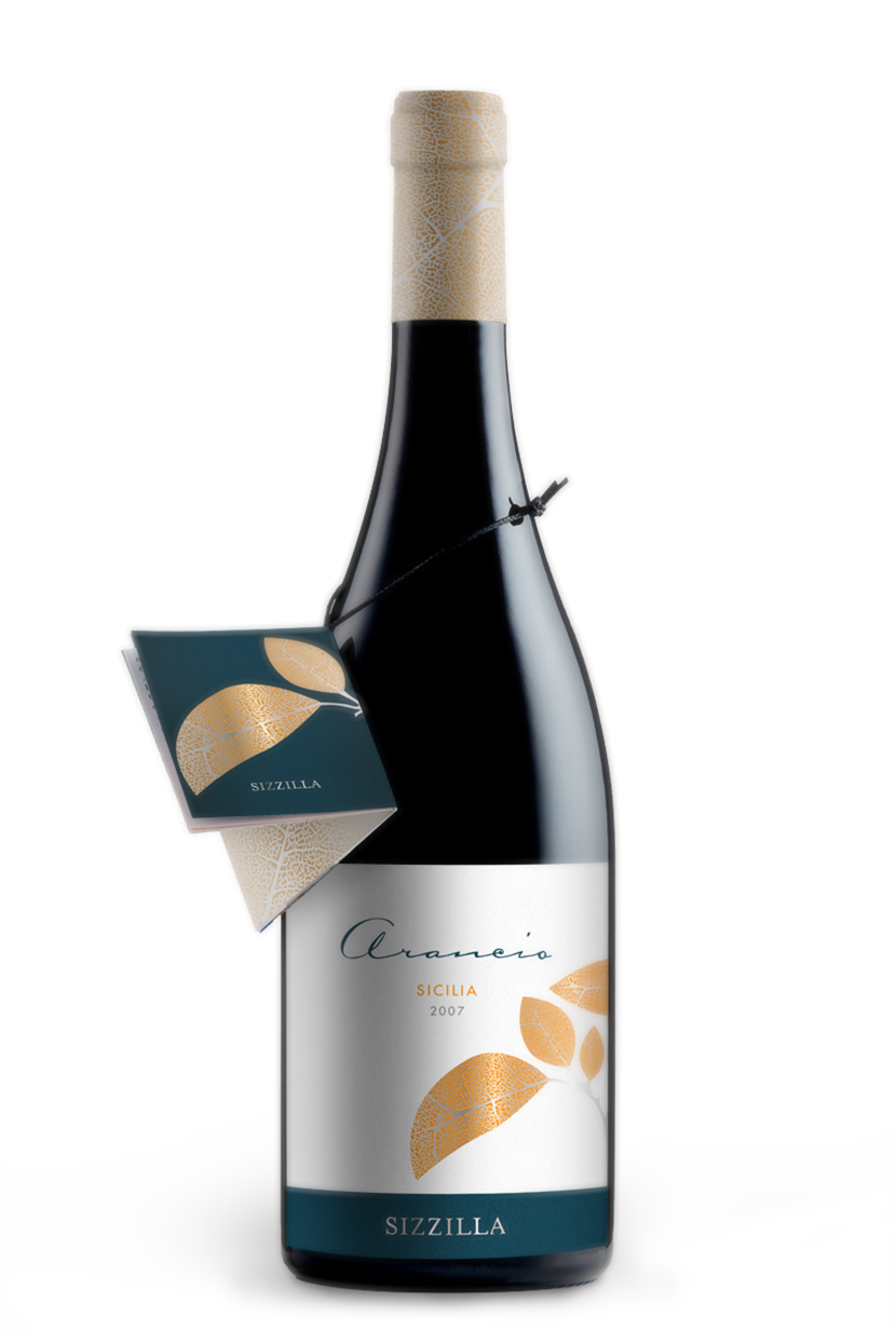
Nero d’Avola and Cabernet Sauvignon: A Fusion of Sicily’s Dual Souls

Nero d’Avola and Cabernet Sauvignon come together to create a wine that embodies the two souls of Sicily. This region is renowned for its exceptional native grapes like Nero d’Avola and has also embraced international varieties like Cabernet Sauvignon with great success.

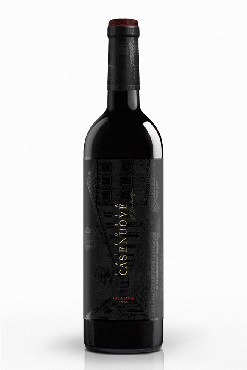
“Riserva” Fattoria Casenuove

“Riserva” represents the pinnacle of excellence at Fattoria Casenuove, showcasing their finest Sangiovese. The label design incorporates traditional imagery essential for such a prestigious and traditional wine. However, it transforms the traditional illustration into a background visible only with the right light angle.

This wine is serious yet imbued with new strength and energy, reflecting the vision of the new owner.


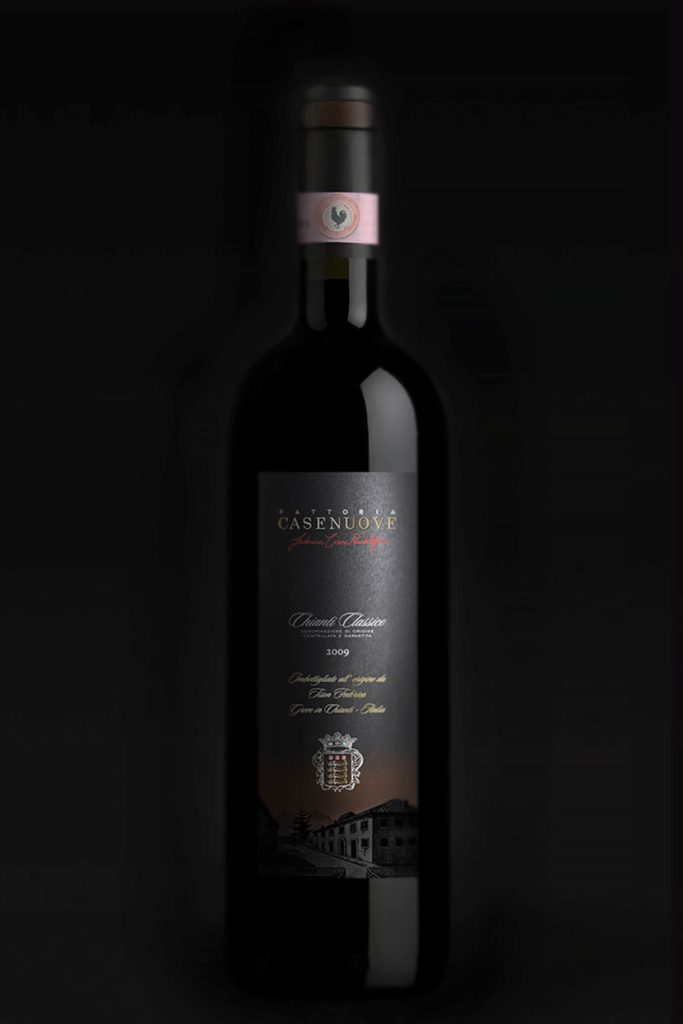
Casenuove / The Redesigned Chianti Classico: A Modern Take on Tradition

Chianti Classico, Gallo Nero, is crafted from Sangiovese grapes and is renowned for its full-bodied character and rich history. Reflecting the wine’s robust nature, label is redesigned to be bold and substantial, incorporating illustrations from the historical label. This modern refresh aligns with the company’s new direction while honouring its storied past.


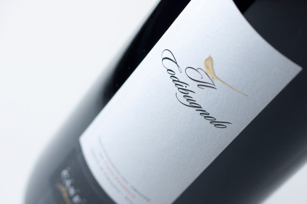
Introducing “Il Codibugnolo”: Light and Playful Elegance

“Il Codibugnolo” is the lightest and most playful wine from the Fattoria Casenuove winery. The owner wanted to feature this beautiful bird with a complex design that initially contrasted with the wine’s character. This project exemplifies the need to balance initial ideas with effective communication.

The final design strikes this balance, perfectly capturing the essence of “Il Codibugnolo” while ensuring the label communicates its lighthearted nature.

“Anfiteatro” Vecchie Terre di Montefili

“Anfiteatro” stands as one of Panzano, Chianti’s most esteemed wines, steeped in tradition and significance. The redesign endeavours to simplify while maintaining the well-known traditional imagery, striking a delicate balance among its various elements.

Experience the essence of tradition and innovation, cheers to heritage and refined craftsmanship!

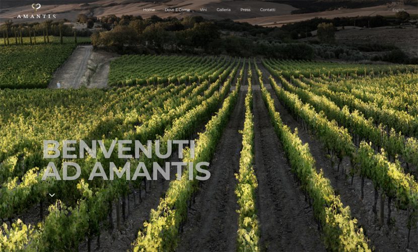
Azienda Agricola Amantis

Amantis is a family story, a young project rooted in an ancient love for the land and wine. This commitment began with the search for the ideal terroir, where they could create wines that embody their passion, dedication, and humanity.

For this project, I designed the website and captured the photographs, aiming to reflect the spirit and beauty of Amantis and its extraordinary surroundings.